INTRODUCTION

A goal of the Friends of Science Society is to educate the public about climate science and the scientific merits of the hypothesis of human induced global warming. The science of climate change is complex. Unfortunately, politics and the media has affected the science. Climate research institutions know that they must present scary climate forecasts to receive continued funding - no crisis means no funding. The media presents stories of climate disaster to sell their products. Scientific research that suggests climate change is mostly natural does not receive much if any media coverage. These factors have caused the general public to be seriously misled on climate issues resulting in wasteful expenditures of billions of dollars in an ineffective attempt to control climate. This document provides an overview of climate change issues as determined by a comprehensive review of the state of climate science.

Global Lower Troposphere Temperatures and Model Mean

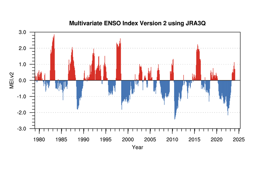
The graph above shows the temperature changes of the lower troposphere from the surface up to about 8 km as determined by the University of Alabama in Huntsville (UAH) satellite data. The best fit line (dark blue) from January 1979 to April 2024 indicates a trend of 0.15 °Celsius/decade. The sharp temperature spikes in 1998, 2010, 2016 and 2023 are El Nino events. Surface temperature data is contaminated by the effects of urban development. The Sun's activity, which was increasing through most of the 20th century, has recently become quiet. The magnetic flux from the Sun reached a peak in 1991. The high magnetic flux reduces cloud cover and causes warming. Since then the Sun has become quiet, however it continues to cause warming for a few decades after its peak intensity due to the huge heat capacity of the oceans. The data are obtained from microwave sounding units (MSUs) on the National Oceanic and Atmospheric Administration's satellites, which relate the intensity or brightness of microwaves emitted by oxygen molecules in the atmosphere to temperature. The MSU data set represent the temperatures of a layer of the atmosphere that extends from the surface to approximately 8 kilometres (5 miles) above the surface. The dark red line is the 5-yr centered average of climate models' lower troposphere. The model trend is 190% of the measurements. The UAH UHIE corr (light blue) line is the Urban Heat Island Effect corrected trend based on this study which gives a correction of -0.017 °C/decade.

The Science In Summary

The history of the Earth tells us that the climate is always changing; from warm periods when the dinosaurs flourished, to the many ice ages when glaciers covered much of the land. Climate has always changed due to natural cycles without any help from people.

The United Nations Intergovernmental Panel on Climate Change (IPCC) is a political organization promoting a theory that recent minor temperature increases may be caused largely by man-made carbon dioxide (CO2) emissions. CO2 is an infrared gas, and increasing concentrations can potentially increase the average global temperature as the gas absorbs long-wave radiation from the Earth and emits the absorbed energy. However, the warming ability of CO2 is limited because much of the absorption spectrum is near saturated. When CO2 concentrations were ten times greater than today the Earth was in the grips of one of the coldest ice ages. The climate system is dominated by strong negative feedbacks from clouds and water vapour which offsets the warming effects of CO2 emissions.

The history of climate and CO2 concentration shows that temperature changes precede CO2 changes and cannot be a major driver of climate. Temperature changes over different time scales have been well correlated to solar cycles, cosmic ray flux and cloud cover. Recent research shows that cosmic rays act as a catalyst to create low clouds, which cool the planet. When the Sun is more active, the solar wind repels the cosmic rays, reducing low cloud cover allowing the Sun to warm the planet.

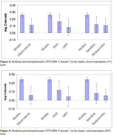
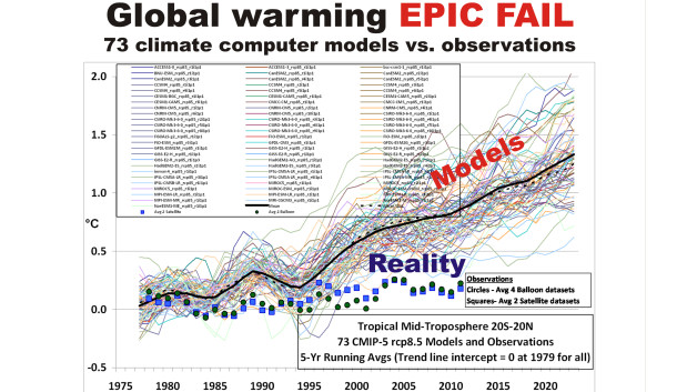
Computer model results presented in the IPCC Fifth Assessment Report predict that global warming will cause a distinctive temperature profile in the atmosphere of enhanced warming rate in the upper atmosphere at 8 to 12 km altitude over the tropics. The predicted temperature profile is the result of an expected increase in water vapour in the upper atmosphere which would amplify a CO2 induced warming three fold. The computer models are programmed to forecast a constant water vapour relative humidity with increasing CO2 resulting in a large water vapour feedback. Actual temperature data shows no such enhanced warming profile. Therefore, the comparison of observed data to computer models proves that no such water vapour induced warming amplification exists, so CO2 is not the main climate driver. In atmosphere layers near 8 km, the modelled temperature trend from 1980 is 200 to 400% higher than observed. Weather balloon data shows that specific humidity has fallen 9% since 1960 in the upper troposphere (400 mbar pressure level) where the models predict the greatest feedback. Adding CO2 to the atmosphere may reduce upper atmosphere water vapour, the most important greenhouse gas, resulting in only a small increase of the greenhouse effect.

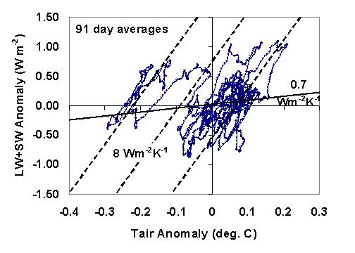
An analysis of satellite data shows that clouds cause a strong negative feedback on temperature, but climate models assume that clouds cause a positive feedback. Modellers assumed that all cloud changes are caused by temperature changes which results in them inferring a positive feedback. But changing cloud cover can also cause temperature changes. Scientists can now separate these two effects. The correct analysis shows that clouds cause a strong negative feedback, so if temperatures increase, cloud cover increases, reflecting solar energy back to space and greatly reducing the warming effect of CO2 emissions.

Several planets and moons have warmed recently along with the Earth, confirming a natural sun caused warming trend. Over longer time periods, as the solar system moves in and out of the galactic arms the cosmic ray flux changes, causing ice ages and warm ages. A comparison of temperature and solar activity proxy data suggests that solar effects can explain at least 75% of the surface warming during the last 100 years.

CO2 is plant food and the increase in the CO2 concentration may have increased the global food production by 15% since 1950 resulting in huge benefits for people. For Canada, any CO2 warming effect would also benefit us by reducing our space heating costs and making a more pleasant climate.

The IPCC predicts that global average temperatures will increase by 0.17 to 0.38 °C per decade to the end of the century depending on the rate of CO2 growth in the atmosphere and other assumptions. The projections assume that no action is taken to limit CO2 emissions. However, these predictions are unrealistic because they falsely assume that the recent temperature changes are driven solely by CO2 and that the Sun has little effect on climate. A recent study of past climate change used by the IPCC has been shown to be wrong due to the use of a faulty algorithm, and the inappropriate selection of data.

The land temperature record is contaminated by the urban heat island effect. Fully correcting the land temperature record would reduce the warming trend from 1980 to 2002 by half. The IPCC historical CO2 record may be incorrect due to inappropriate adjustments to the ice core data, and ignoring direct historical CO2 measurements. The IPCC selects and adjusts data to conform to its CO2 warming hypothesis and ignores alternative climate theories. This is the wrong way to do science. Many scientists strongly disagree with the IPCC conclusions.

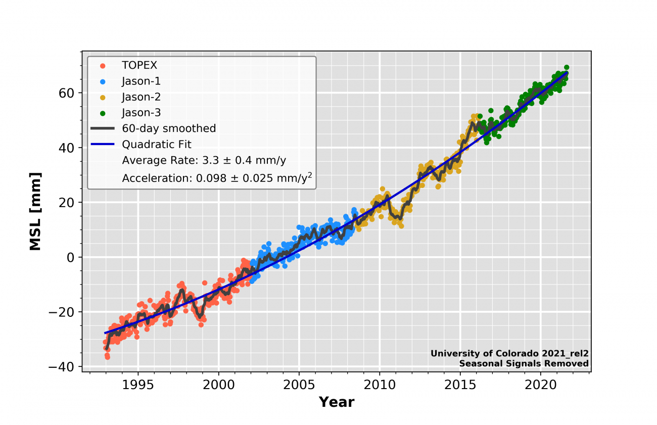
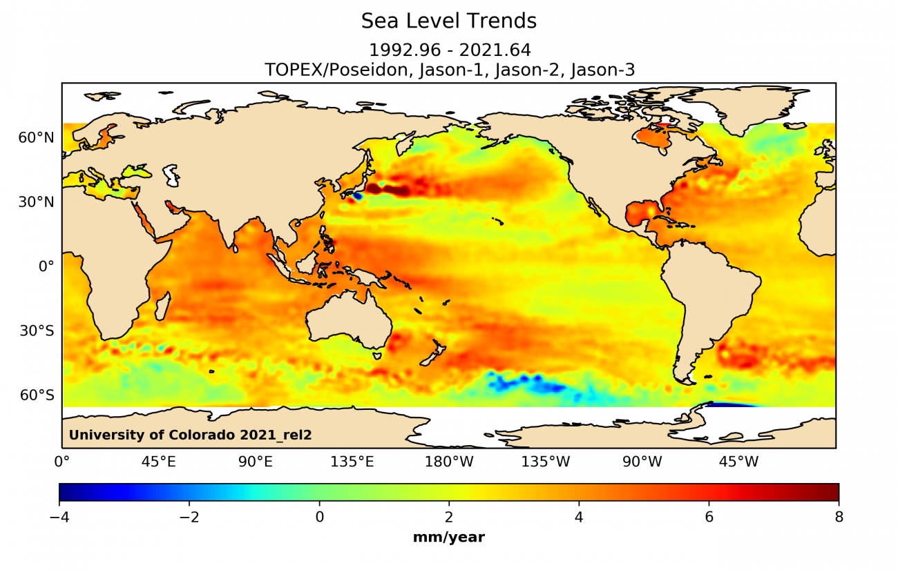
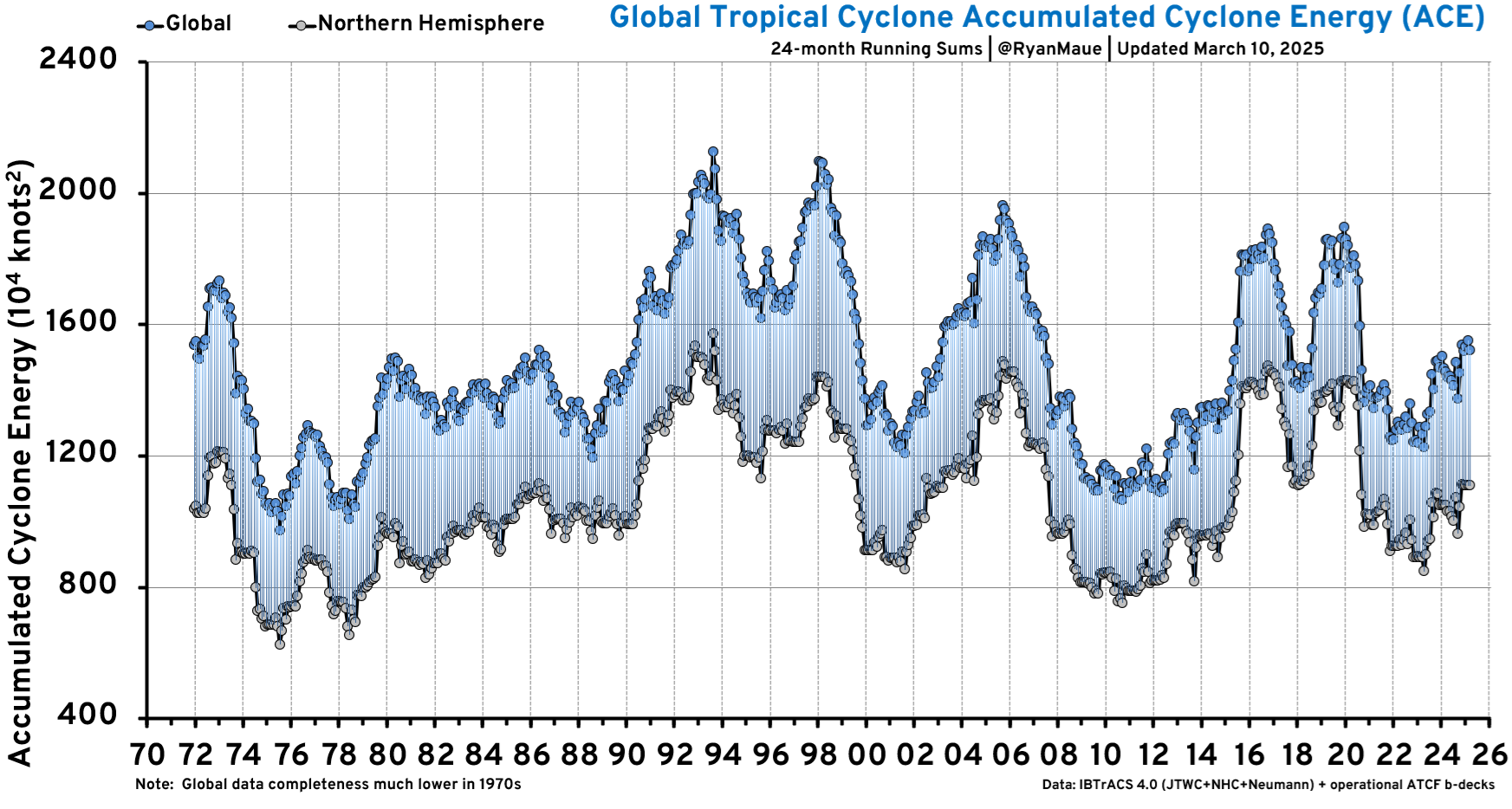
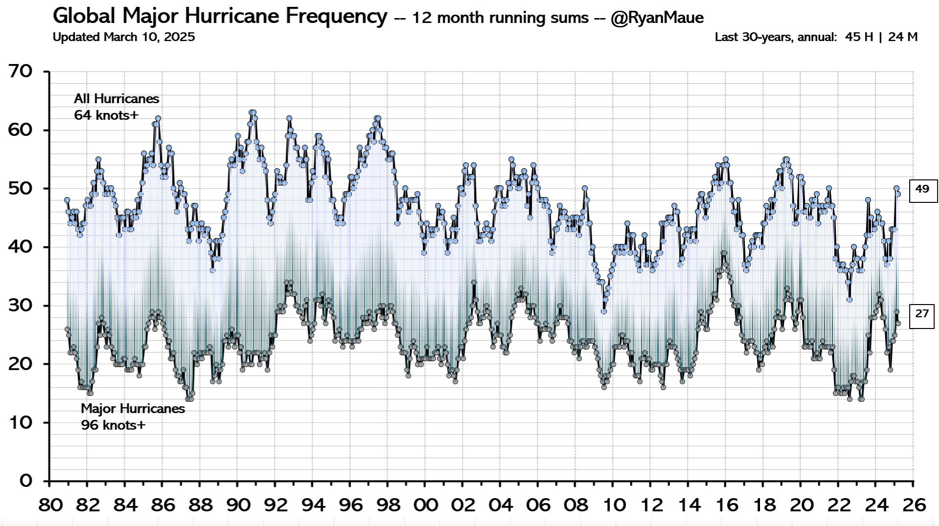
The sea level data shows no increase in the recent rate of sea level rise, and no such increase is expected over the next hundred years. There has been no detected increase in severe storms and there is no reason to expect an increase in the number or intensity of hurricanes resulting from any warming assumed to be from human caused CO2 emissions.

Any increase in temperatures due to human caused CO2 emissions will likely be beneficial to human health. The CO2 fertilization effect will increase the rate of forest growth and CO2 induced crop yield increases will reduce the pressures to cut down forests for farmland expansion. This will greatly benefit animals by slowing habitat destruction.

The benefits of CO2 emissions greatly exceed any likely harmful effects. Several authorities who have studied solar cycles have warned that the Earth may soon enter a cooling phase as the Sun is expected to become less active. The atmosphere may warm because of human activity, but if it does, the expected change is unlikely to be more than 0.8 °C, and probably less, in the next 100 years.

The Greenhouse Effect

This graphic, from Trenberth et al 2009, illustrates the exchange of energy among Space, the Sun, the atmosphere and the Earth.

Global Energy Flows

Greenhouse gases are primarily water vapour, carbon dioxide and ozone. Greenhouse gases are mostly transparent to incoming solar radiation, but absorb outgoing long wavelength radiation. The absorbed energy is then transferred to cooler molecules or radiated at longer wavelengths than the energy previously absorbed. This process makes the Earth warmer than it otherwise would be without the greenhouse gases (but with the atmosphere and clouds) by about 33 degrees Celsius.

Water vapour and clouds together account for over 70% of the total current greenhouse effect. However, in terms of changes to the greenhouse effect due to human activities, water vapour is generally considered a feedback and not a forcing agent. Computer simulations show the a uniform 1.8% change in water vapour has the same effect on outgoing longwave radiation as a 10% change in CO2 concentration.

More greenhouse gases reduce the transparency of the atmosphere to longwave radiation from the surface.

Radiation transmitted

The top panel of the graph above shows the absorption spectral intensity of the greenhouse gases. Most of the short wave length solar radiation in the visible part of the spectrum is transmitted to the surface. Most of the upward thermal long wave radiation from the surface is absorbed except in the atmospheric window indicated by the blue region. About 16% of the long wave radiation is transmitted directly to space and the rest is absorbed by greenhouse gases. The middle panel shows the total absorption bands by wavelength of downward solar radiation and upward thermal radiation. The gray shading at 100 percent indicates that the energy is fully absorbed at that wavelength. The lower panel shows the absorption of the major greenhouse gases. Comparing the CO2 and H2O absorption spectra shows that much of the CO2 spectrum overlaps with that of water. Parts of the CO2 spectrum are already fully saturated. Adding more CO2 will result in ever diminishing effects as more of the available wavelengths become saturated. The temperature response to adding CO2 to the atmosphere depends on the amount of positive and negative feedbacks from water vapour, clouds and other sources. The temperature effect of increasing CO2 concentration is approximately logarithmic. This means if doubling the CO2 concentration from 300 ppm to 600 ppm, a 300 ppm increase, causes the temperature to rise by 1 °C, it would take another 600 ppm increase to add a further 1 °C temperature gain. Methane has an absorption band (at 8 micrometres) that largely overlaps with water vapour, so an increase in methane has little effect on temperature.

ModtranRadiativeForcingDoubleCO2.jpg

The above diagram shows the upward radiation spectrum from the top of the atmosphere at 20 km with 300 ppm CO2 and 600 ppm CO2 as calculated by the MODTRAN radiative code. (Note that the horizontal axis of this diagram shows wavenumber, or number of wavelengths per cm, which is the reciprocal of the wavelength in micrometers used in the previous diagram.) This model calculated radiation is very similar to what is actually measured by satellites from space. The green curve shows the emissions spectrum with 300 ppm CO2 in the atmosphere and the blue curve shows the spectrum with 600 ppm CO2 with the same surface temperature and water vapour profile. The model shows that doubling the CO2 concentration changes the spectrum only at the edges of the main CO2 absorption band, at 600 and 740 cm-1. The resulting forcing of 3.39 W/m2 would cause the surface temperatures to increase if not offset by negative feedbacks.

CO2 Versus Water's Contribution

CO2, water vapour and clouds have the most significant contributions to the greenhouse effect. Various sources give conflicting estimates of the contributions of these components to the greenhouse effect. The infrared absorption spectrum of atmospheric greenhouse gases is very complex. In some regions absorption frequencies of various greenhouse gases overlap, so the contributions of each component do not add linearly. Radiation at a particular frequency can be absorbed by either water vapour or CO2. The concentration of water vapour is dependent on temperature and varies greatly by both latitude and altitude. Also, water changes from a liquid to a gas with heat energy for the latent heat of evaporation required for the transformation.

Most sources put the greenhouse effect at 33 °C. This is the difference between the current air surface temperature (15 °C) and temperature without the greenhouse effect of gases and clouds, but with the clouds continuing to reflect 31% on the incoming solar radiation.

Nature does not allocate the contribution of various greenhouse gases - only the total effect is meaningful. Nevertheless, a rough estimate of the contributions can be made. The relative contribution of water, clouds and CO2 to the greenhouse effect can be estimated in two ways; by estimating from radiation models the change to the greenhouse effect by removing one component, and by estimating the greenhouse effect of having only that one component in the atmosphere. If one removes the water vapour & clouds' greenhouse effect the remaining components would trap 34 percent of the heat, implying that water vapour & clouds would trap 66 percent as shown in the "Heat Not Trapped" column of the table below. The sum of the components calculated this way is only 80% of the greenhouse effect due to overlapping absorbing spectra. Similarly, if one includes only water vapour and clouds (no CO2, O3 or Other), they would trap 85% of the long wave radiation. However, the contributions of each component adds up to 126% of the greenhouse effect.

It is reasonable to just allocate the overlap proportionally to each component, so the effect is normalized in the "Relative Effect" columns so the sum of the effects equals 100%. This calculation suggests that water vapour & clouds contribute 70% to 80%, and CO2 contributes 10% to 20% of the greenhouse effect as shown in the table below:

Change in Long-wave Absorption
Component Remove Component Heat Trapped Heat Not Trapped Relative Effect Component Only Heat Trapped Relative Effect Average of Methods
None 100 0        
Water & Clouds 34 66 82.5% 85 67.5% 75.0%
CO2 91 9 11.3% 26 20.6% 15.9%
O3 97 3 3.8% 7 5.6% 4.7%
Other 98 2 2.5% 8 6.3% 4.4%
Total   80 100.0% 126 100.0% 100.0%

This gives a rough estimate of component contribution to the current total greenhouse effect, but this tells us almost nothing of the incremental effect of changing the concentration of a component.

Water vapour is the most important gas of the Greenhouse Effect. Water vapour is usually considered a feedback, while CO2 is considered a forcing because the residence time of a change in water vapour concentration is very short compared to CO2. Human caused water emissions (other than high altitude airplanes) do not have a significant effect on climate, but water can have a significant effect as a feedback on a temperature change initiated by the Sun or CO2 emissions.

If one magically removed 20% of all water vapour in the atmosphere, water will quickly evaporate from the oceans to replace it so that in 20 days the water concentration will be 99% of the original value as the graph below shows.

water_removal.jpg

Likewise, if humans suddenly doubled our water emissions from the surface, in a few days the increased water vapour will rain out leaving the water vapour concentration almost unchanged. The above graph and absorption values were calculated using the Goddard Institute for Space Studies' General Circulation Model.

These calculations do not include the effects of airplanes. It is so cold at the elevation that airplanes fly that there is virtually no water vapour. The only time water gets that high is when high ground temperatures cause thermal uplift bringing water up with it. It is too cold up there for water to exist as vapour so droplets form and we see this as airplane vapour trails. These are artificial clouds of the type that traps infrared radiation but passes sunlight therefore creating a warming effect. Water vapour injected into the upper atmosphere has a much longer residence time than water injected into the atmosphere near the surface, so it may have a minor effect on climate.

Climate Is Always Changing

The Earth's history shows that the climate has always been changing, over both short-term and long-term time scales. These changes have sometimes been abrupt and severe, without any help from humans. Climate temperature reconstructions are determined from a variety of sources, such as from tree ring width studies and ocean floor sediments. During the last 2 billion years, the Earth has alternated between cool periods like today, and warm periods like when the dinosaurs roamed the planet. The figure below on the left is a temperature reconstruction of the Earth over 2 billion years. Temperatures over this time frame are determined by mapping the distribution of ancient coals, desert deposits, tropical soils, salt and glacial deposits, as well as the distribution of plants and animals that are sensitive to climate, such as alligators, palm trees & mangrove swamps. See here for further information.

  Temperature Over Geological Time

Temperature Over Geological Time

CO2_temp600MMya.jpg

The chart above on the right is from here and it shows that CO2 levels have been declining since the end of the Jurassic period to the start of the industrial era. The change in CO2 as indicated by the red line in the red circle is the change in CO2 since the industrial revolution.

The graph below from here shows the estimated CO2 concentrations over the last 5.5 million years on several logarithmic time scales. It shows that CO2 levels 25 million years ago were higher than current levels.

CO2 levels historic

The graph below shows five million years of climate change by combining measurements from 57 globally distributed deep sea sediment cores. The measured quantity is the oxygen 18 isotope fraction, which is a proxy for temperature.

Five MM years of CC

The data is from Lisiecki and Raymo, 2005. The temperature scale is scaled was established by fitting the reported temperature variations at Vostok, Antarctica to the observed isotope variations, so the temperature scale is representative of Vostok changes.

Greenland temperature history

The above graph from here shows 25,000 years of Greenland temperature history determined from the Greenland Ice Sheet Project Two (GISP2). After 5 years of drilling through the ice sheet into the bedrock to July 1993, an 3053 m ice core was recovered. By measuring the ratio of two isotopes of oxygen (specifically 18O to the much more common 16O) one can infer the air temperature at the time that the snow in each annual layer crystallized. This technique is considered quite accurate. Strong, abrupt warming is shown by nearly vertical rise of temperatures, strong cooling by nearly vertical drop of temperatures (Modified from Cuffy and Clow, 1997). Dr. Don Easterbrook writes, "Temperature changes recorded in the GISP2 ice core ... show that the global warming experienced during the past century pales into insignificance when compared to the magnitude of profound climate reversals over the past 25,000 years. In addition, small temperature changes of up to a degree or so, similar to those observed in the 20th century record, occur persistently throughout the ancient climate record. ... Over the past 25,000 years, at least three warming events were 20 to 24 times the magnitude of warming over the past century and four were 6 to 9 times the magnitude of warming over the past century."

Ice core results from the North Greenland Eemian Ice Drilling (NEEM) published in January 2013 for the warm period of the last interglacial from 128,000 to 122,000 years ago, known as the Eemian, was 8 +/- 4 °C warmer than the recent millennium. The 2540 m long ice core was drilled during 2008 to 2012. Full results presented in "Eemian interglacial reconstructed from a Greenland folded ice core".

  Northern Hemisphere Temperature History

Holocene Temperature History

The graph above shows the northern hemisphere temperature history since the last ice age.

Greenland GISP2 Ice Core history 10,000 years

The graph above shows Greenland temperatures as determined by the GISP2 ice core. It is a detailed version of a previous graph above, from here.

  Temperature History from North Atlantic Ocean Sediments

Temperature History from North Atlantic Ocean Sediments

The graph above shows temperature variations of the past 3,000 years (during recorded history), as determined from ocean sediment studies in the North Atlantic. [Keigwin, 1996]. Note the rapid variations, as well as the much warmer temperatures 1,000 and 2,500 years ago.

A new temperature reconstruction with decadal resolution, covering the last two millennia, is shown below for the extratropical Northern Hemisphere (90-30 N), utilizing many palaeo-temperature proxy records, from Ljungqvist 2010 here. The shading represents 2 standard deviation errors.

Northern Temperature variations of the past 3,000 years

RWP = Roman Warm Period AD 1-300 DACP = Dark Age Cold Period 300-900
MWP = Medieval Warm Period 800-1300 LIA = Little Ice Age 1300-1900
CWP = Current Warm Period 1900-present  

The proxy data shows that parts of the Roman Warm Period and the Medieval Warm Period were as warm as the 1940s. Figure 3 of the Ljungqvist 2010 paper shows the HadCRUT3 northern exotropic 1990s decadal temperatures were about 0.15 °C higher than the peak of the MWP, however the proxy data did not record the second half 20th century temperature rise.

Climate is always changing, as the history of Europe's temperature over the last thousand years shows in the graph below.

  1000 year Temperature History IPCC 1990

IPCC FAR Temperature history

The temperature history shown above was published in the first IPCC report in 1990, based on Lamb's estimated climate history of Central England.
Clearly, human activity could not have had a significant effect on the temperature changes before 1900. These changes are the result of natural processes.
NASA's GISS temperature graphs since 1880 can be found here. The graph below shows the GISS global annual temperature history. The last year displayed is 2022

GISTemp4

The graph below shows the HadCRUT5 annual temperatures from 1850 to 2022.

HadCRUT5

HadCrut5 is the global surface temperature index produced by the Hadley Centre and the Climate Research Unit, England. It combines land and marine temperature data. The graph above from here shows the annual northern hemisphere, southern hemisphere and global surface temperatures from 1850 to 2022.

The multi-model mean doesn't represent the multi-decadal oscillations well but otherwise matches the measured temperature fairly well to 2000. The modellers use high negative aerosol forcing to compensate for the models being too sensitive to greenhouse gases. The models are running too hot during the 21st century despite the measurements being too high due to contamination from urban warming.

Global surface temperature and climate model projection

The HadCRUT3 dataset was discontinued in May 2014. The HadCRUT4 dataset was introduced to add more coverage in the northern polar region. The HadCRUT5 data set is an infilled, statistical analysis that extends coverage in data sparse regions. The graph below shows a comparison on the HadCRUT3, versions HadCRUT4.0 and 4.2 to 4.6 and HadCRUT5.0 datasets.

HadCRUT annual global temperature 21 century by version

The graph below shows the global monthly 21st century temperatures from the HadCRUT4.6 and HadCRUT5.0 datasets, with the best-fit linear trends. The HadCRUT4.6 version ends at December 2021. THe HadCRUT5.0 version has a higher slope because it infills data where there are no measurements.

HADCRUT4.6 and 5.0 Global 21st Century Temperature Histories

There has been a lot of attention of sea ice area because AGW is predicted to warm polar regions much more than other areas. The graph below shows the global sea ice extent by month and annually from satellite data found here. Sea ice extent is defined as the area within each pixel of satellite data that contains at least 15% sea ice.

global sea ice extent

The global sea ice extent has been variable with the lowest annual average extent in 2023. The linear trend is -0.55 million km2/decade. See here for graphs of Arctic and Antarctic sea ice extent.

Temperature Leads CO2 Changes

The temperature of the Earth has warmed slightly, about 0.8 degrees Celsius, over the 20th century. Over this time, CO2 concentration in the atmosphere has increased, mostly due to the increased use of fossil fuels. However, the Sun has increased in intensity since 1900 which may have induced much of the observed warming since then. Scafetta and West estimate that the Sun may have caused 10 to 20% of the increase in CO2 during the last century. (See [7] in their paper.) A short-term correlation does not imply that the CO2 increase caused the temperature increase. Causation can be inferred if there is a correlation over several cycles of CO2 concentration changes, with the CO2 change preceding the temperature change. The actual climate history shows no such correlation, and there is no compelling evidence that the recent rise in temperature was caused by CO2. Temperatures have been variable over time, and do not correlate to CO2 concentration. When CO2 concentrations were 10 times higher than they are now we were in a major ice age. As a greenhouse gas, CO2 is vastly outweighed by (natural) water vapour and clouds, which accounts for over 70% of the greenhouse effect. Human-related CO2 emissions soared after 1940. Yet most of the 20th century's world-wide temperature increase occurred beforehand. See here for a graphic of the carbon cycle.

The CO2 concentration with the lower troposphere temperatures from UAH are shown below. The CO2 concentration year average has increased from 376.8 parts per million (ppm) in 1979 to 418.6 ppm in 2022.

GlobalTropTemp&CO2.jpg

The actual increase of CO2 concentration averaged 0.5% per year since 1990 and is currently about 0.52%/year.

Fischer et al. (1999) examined records of atmospheric CO2 and air temperature derived from Antarctic Vostok ice cores that extended back in time across a quarter of a million years. Over this immense time span, the three most dramatic warming events experienced on earth were those associated with the terminations of the last three ice ages; and for each and every one of these tremendous global warmings, Earth's air temperature rose well before there was any increase in atmospheric CO2. In fact, the air's CO2 content did not begin to rise until 400 to 1,000 years after the planet began to warm. Ice cores provide a detailed record of local temperature and CO2 concentrations. A study by Caillon et al. (2003) finds that the CO2 increase lagged Antarctic deglacial warming by 800 +or- 200 years. The authors measured the isotopic composition of argon40 and CO2 concentration in air bubbles in the Vostok core during the end of the third most recent ice age (Termination III), 240,000 years before the present. The argon40 isotope is found to be an excellent proxy for temperature.

Vostok Ice Core Data over End of Third Ice Age BP
  CO2 and Argon (Temperature) Age Scales are Shifted 800 years

CaillonTermIII 3.jpg

The CO2 concentration shown by the black line is plotted against age in years before present (BP) on the bottom axis, and the Argon40, a temperature proxy, shown by the grey line is plotted against age on the top axis. The age scale for the CO2 has been shifted by a constant 800 years to obtain the best correlation of the two data sets. The correlation shows that temperature changes precede CO2 concentration changes by about 800 years.

These findings confirm that an increase in CO2 has never initially caused an increase in temperature during a deglaciation. Temperature increases cause the oceans to expel CO2 because CO2 is more soluble in cold water, increasing the CO2 content of the atmosphere. When temperature is at its maximum in each cycle and starts to fall, CO2 concentrations continue to increase for another 800 years! As CO2 increases, temperatures fall. This is the opposite of what one would expect if CO2 were a primary climate driver. The ice core data proves that CO2 is not a primary climate driver. One must invoke reverse time causality to claim the ice core data shows CO2 causes temperature change, like suggesting actions taken today can affect the conquests of Mongol leader Genghis Khan. Logic demands that cause must precede effect. Increases in air temperature drive increases in atmospheric CO2 concentration.

A more recent portion of the Vostok ice core record from Joanne Nova's Skeptics Handbook #1, found here, is shown below.

VostokTempVsCO2.jpg

See CO2Science for more information. See here for the Cailion et al (2003) paper. A graph of the Vostok ice core data over 420,000 years is shown below. A large version is here.

Vostok ice core 420 ky

Sun Activity Correlates With Temperature

Numerous papers published in major peer-reviewed scientific journals shows the Sun is the primary driver of climate change. There is a very strong correlation between the Sun activity and temperature.

Early in the nineteenth century, William Herschel (1738-1822), discoverer of Uranus, found that five periods of low number of sunspots corresponded to high wheat prices when the temperatures were cold. (Cold climate reduces the supply of wheat causing its price to rise.) See "The Varying Sun & Climate Change", Soon & Baliunas, 2003.

E. Friis-Christensen and K.Lassen have shown that the length of the mean 11 year Sunspot cycle correlates to the northern hemisphere temperature during the past 130 years. The length of the Sunspot cycle is known to vary with solar activity, whereas high solar activity implies short sunspot cycle length. See here for further information.

See here for an updated plot based on Friis-Christensen and Lassen's methodology.

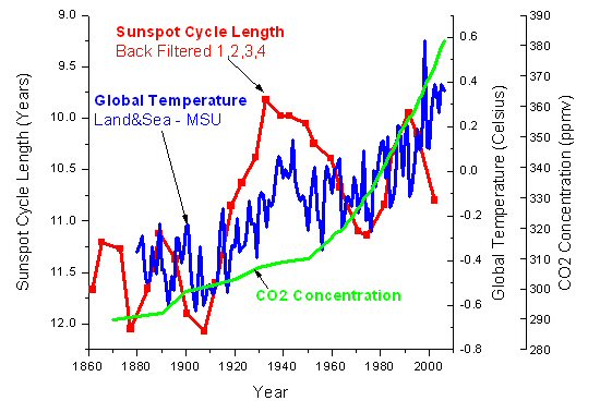
Here is a correlation of the sunspot cycle length, global temperature and CO2 concentrations.

  Sunspot Cycle Length Temperature and CO2

Sunspot cycle length

The red squares on the graph represent the sunspot cycle lengths. One point is the cycle length from the time of the maximum number of sunspots to the time of the maximum number of sunspots of the next cycle, and the following point is the cycle length from the time of the minimum number of sunspots to the time of the minimum number of sunspots of the next cycle. The sunspot cycles are back filtered using weighting 1,2,3,4 applied to each cycle point, both min to min and max to max. This assumes that the current cycle has the most effect on temperature (weight 4), and previous half cycles affect current temperatures in declining amounts, but future cycles have no effect on the current temperature. The temperature curve in blue used the HadCRUT3 land and sea data to 1978, the MSU satellite data from 1984 to 2006, and the average of the datasets for 1979 to 1983. This eliminates much of the urban heat island effects. The temperatures are unfiltered annual. The CO2 concentrations (ppmv) from 1958 to 2007 are derived from air samples collected at the Mauna Loa Observatory, Hawaii. CO2 concentrations prior to 1958 are uncertain.

Note that there is a correspondence between sunspot cycle length and temperature. Both the temperature and the cycle length curves begin to rise at 1910, and temperatures fall after 1945 to 1975 when the cycle length curve falls, and both curves rise again after 1975. Temperatures have been increasing since 1980 faster than can be explained by the sunspot cycle length, indicating a possible human CO2 contribution. The recent increase of the cycle lengths explains why there has been no warming since 2002. Temperature changes are expected to follow Sun activity changes due to a time lag resulting from the large heat capacity of the oceans.

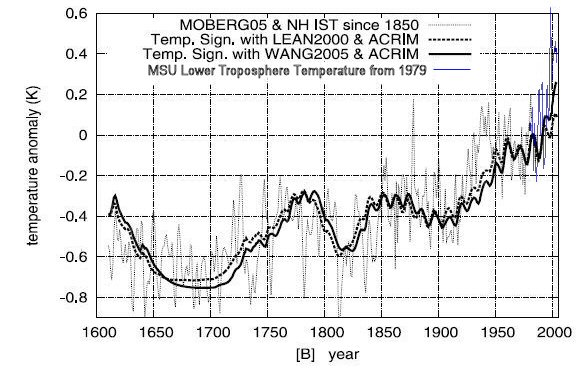
N. Scafetta of Duke University, Durham, NC and B.J. West of the US Army Research Office, NC studied the solar impact on 400 years of the Northern Hemisphere temperatures since 1600. They find good correspondence between temperature and solar irradiance proxy reconstructions up until 1920 as shown on the graph below.

  Northern Hemisphere Temperature vs Solar Irradiance 400 years

Moberg NH temperature and TSI

The temperature curve is derived from proxy records to 1850 by Moberg et al. [2005], and from instrumental surface temperature data from 1850 to about 1980. The surface temperature record includes the urban heat island (UHI) and land use changes effects. The Northern Hemisphere MSU lower troposphere record is shown from 1979 in blue, which eliminates most of the UHI effects. Two different solar irradiance proxy reconstructions are shown: Lean, 2000; Wang et al., 2005. Both curves merge the ACRIM satellite data since 1980 with the proxy data. By assuming ACRIM, the solar activity has an increasing trend during the second half of the 20th century. This graph is modified from the version created by Scafetta and West, which uses the contaminated instrument record after 1979 instead of the satellite data. See the original version here.

Note the low solar activity periods occurring during the Maunder Minimum (1645 to 1715, the Little Ice Age) and during the Dalton Minimum (1795 to 1825).

Note the excellent correlation from 1600 to 1900 when humans were unlikely to effect climate. During the 20th century one continues to observe a significant correlation between the solar and temperature patterns: both records show an increase from 1900 to 1950, a decrease from 1950 to 1970, and again an increase from 1970 to 2000.

A divergence of the curves from the Scafetta and West original graph indicates that the Sun is responsible for 56% using Lean 2000, and 69% using Wang 2005, of the northern hemisphere warming from 1900 to 2005. The authors estimate the error at 20%.

There are two solar composites available from satellite data. The ACRIM is obtained directly from high precision satellite data.

There is a gap (1989 - 1992) in the satellite record that was due to a delay in launching a new ACRIM satellite after the 1986 space shuttle challenger disaster. The delay caused a gap of two years in the ACRIM system that measures solar irradiance. The only data available to fill the gap was from a different monitor called the earth radiation budget (ERB) system which wasn’t designed to monitor the Sun. It had little precision and only had a view of the sun during brief intervals of its orbit. The ACRIM record suggested an increase in solar irradiance from the early 1980s through to the end of the 1990s. A rival group called PMOD claimed that the ERB sensors experienced an increase in its sensitivity over the gap period, so they adjusted downward the second ACRIM satellite data to show a decline of solar intensity. Dr. Douglas Hoyt, the scientist who had been in charge of the ERB satellite mission, said “there is no known physical change in the electrically calibrated [system] that could have caused it to become more sensitive. And no one has ever come up with a physical theory for the instrument that could cause it to become more sensitive. The IPCC reports have downplayed the role of solar activity in recent climate change by using only the PMOD solar irradiance interpretation.

The authors did a similar analysis using the Mann and Jones 2003 temperature reconstruction. This temperature history shows little variation before 1900 and shows a hockey stick shape. This reconstruction has been severely criticized for several reasons. See The IPCC Hockey Stick section of this essay. The authors found that the Mann and Jones 2003 reconstruction (when compared to the Lean 2000 data) results in an unphysical zero response time to solar forcing. The ocean's large heat capacity should result in a time lag of surface temperatures with respect to long time solar changes of several years, so this reconstruction cannot be correct.

The authors' analysis shows the Sun has contributed 50 to 69% of the surface warming depending on the reconstructions utilized. The remainder may be due to CO2, UHI and land use changes. The authors compare the Sun's irradiance to the Northern Hemisphere land surface temperatures, which are contaminated with the urban heat island effect. The global MSU satellite temperatures, which are not contaminated by the UHI effect, have increased by half as much as the North Hemisphere temperatures since 1980. If the Scafetta and West analysis used the uncontaminated satellite data since 1980, the results would show that the Sun has contributed at least 75% of the global warming of the last century. See more about the UHI effect later in this essay. See here for the November 2007 article.

Climate alarmists claimed that solar activity couldn’t possibly have anything to do with the warming of the late 20th century because sunspot numbers peaked about 1960 then decline while global temperatures rose over the 2nd half of the 20th century. The solar activity curve, which was updated in 2015, shows total solar irradiance peaked in 1990 with solar cycle 22. Solar activity isn’t just sunspot numbers. Lüning and Vahrenholt write “The sun not only reached its maximum at the end of the 20th century, but was apparently stronger than at any time over the past 10,000 years." The graph below shows sunspot numbers and total solar irradiance (TSI), source.

TSI and Sunspots

A group of NASA and university scientists have found convincing evidence of a link between the Sun activity and climate by comparing the records of the historical water level of the Nile River to the number of auroras observed in northern Europe and the Far East between 622 and 1470 AD. Auroras are bright glows in the night sky following solar flares, and are an excellent means of tracking solar activity. See this link for further information.

A study by WJR Alexander et al, published June 2007 compared hydrometeorological data to solar variability. The study looked at rainfall, river flow and flood data. The authors conclude that there is "an unequivocal synchronous linkage between these processes in South Africa and elsewhere, and solar activity." The study included an analysis of the level of Lake Victoria, which has been carefully monitored since 1896. In the early 1960s a dramatic rainfall increase significantly raised the lake level, and the level since then has been falling at about 29 mm per year. The decline has been removed from the data plotted below. The plot shows two periods of strong correlation between lake level and sunspot number, corresponding to periods of high levels of volcanic dust.

Lake Victoria Water Level and Sunspot Number

Lake Victoria Water Level and Sunspot Number

See the paper "Linkages between solar activity, climate predictability and water resource developmenthere.

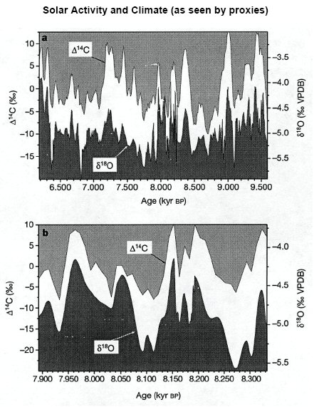
Longer term, here is a correlation of a solar proxy to a temperature proxy for a period of 3000 years. Values of carbon-14 (produced by cosmic rays hence a proxy for solar activity) correlate extremely well with oxygen-18 (temperature proxy). The lower graph shows a particularly well-resolved time interval from 8,350 to 7,900 years BP.

Solar activity and climate 3500 years

The above graph summarizes data obtained from a stalagmite from a cave in Oman, as reported in the paper, Neff, U., et al. 2001.

A team of researchers led by scientists from the Max Planck Institute for Solar System Research analysed radioactive isotopes in trees and has found that the Sun has been more active in the last half of the 20th century than in any time in the last 8000 years. This study showed that the current episode of high solar activity since about the year 1940 is unique within the last 8000 years. See a press release here. A graph from the study is below. The bottom chart is a detail of the shaded period of the top chart from 9300 to 8600 years before the present.

Solar Activity 11,500 years

A study published by the Danish Meteorological Institute compares the Koch ice index which describes the amount of ice sighted from Iceland, in the period 1150 to 1983 AD, to the solar cycle length, which is a measure of solar activity. The study finds "A close correlation (R=0.67) of high significance (0.5 % probability of a chance occurrence) is found between the two patterns, suggesting a link from solar activity to the Arctic Ocean climate."

Koch ice index and Solar Cycle Length
Source.

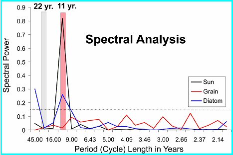
Tim Patterson, an adviser to the FoSS, has studied high-resolution Holocene climate records from fjords and coastal lakes in British Columbia and demonstrates a link between temperature and solar cycles.

Patterson Spectral analysis

The spectral analysis shown here is from sediment cores obtained from Effingham Inlet, Vancouver Island, British Columbia. The annually deposited laminations of the core are linked to the changing climate conditions. The analysis shows a strong correlation to the 11-year sunspot cycle.
See here for a powerpoint slide show by Tim Patterson.

A paper by Soon et al 2015 titled "Re-evaluating the role of solar variability on Northern Hemisphere temperature trends since the 19th century" in section 5 compares an updated Hoyt & Schatten total solar irradiance reconstruction to Arctic and Northern Hemisphere temperature conposites that are based on mostly rural temperature data to remove the effects of urban development. The general agreement between the temperature and solar activity trends is striking. The graph below shows a correlation of R2= 0.48, implying that solar variability has been the dominant influence on Northern Hemisphere temperature trends since at least 1881.

TSI compared to Arctic and NH temperatures

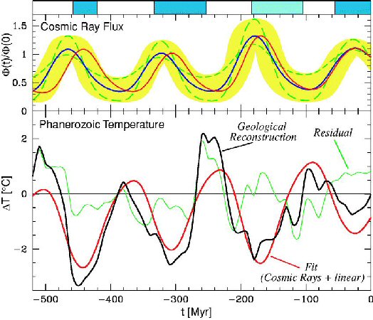
N. Shaviv and J. Veiser using seashell thermometers shows a strong correlation between temperature and the cosmic ray flux over the last 520 million years.

Cosmic Ray Flux and Tropical Temperature Variation Over the Phanerozoic 520 million years

Cosmic Ray Flux and Tropical Temperature Variation

The upper curves describe the cosmic ray flux (CRF) using iron meteorite exposure age data. The blue line depicts the nominal CRF, while the yellow shading delineates the allowed error range. The two dashed curves are additional CRF reconstructions that fit within the acceptable range. The red curve describes the nominal CRF reconstruction after its period was fine-tuned to best fit the low-latitude temperature anomaly. The bottom black curve depicts the smoothed temperature change derived from calcitic shells over the Phanerozoic. The red line is the predicted temperature model for the red curve above. The green line is the residual. The top blue bars indicate ice ages.

A paper by Nicola Scafetta, May 2012, titled "A shared frequency set between the historical mid-latitude aurora records and the global surface temperature" compares the historical records of mid-latitude auroras from 1700 to the surface temperature records. It shows that auroras record share the same oscillation frequencies evident in the temperature record and in several planetary and solar records. The author argues that the aurora records reveal a physical link between climate change and astronomical oscillations. The abstract states:

"In particular, a quasi-60-year large cycle is quite evident since 1650 in all climate and astronomical records herein studied ... The existence of a natural 60-year cyclical modulation of the global surface temperature induced by astronomical mechanisms, by alone, would imply that at least 60 to 70% of the warming observed since 1970 has been naturally induced. Moreover, the climate may stay approximately stable during the next decades because the 60-year cycle has entered in its cooling phase."

More analysis is presented by Scarfetta in his 2011 presentation "Heliospheric oscillations and their implication for climate oscillations and climate forecast" at the 3rd Santa Fe Conference on Global and Regional Climate Change.

A paper published by Moffa-Sánchez et al in Nature Geoscience, March 2014, titled "Solar Forcing of North Atlantic Surface Temperature and Salinity Over the Past Millennium" found that solar activity correlates well with North Atlantic temperatures. The abstract states:

"There were several centennial-scale fluctuations in the climate and oceanography of the North Atlantic region over the past 1,000 years, including a period of relative cooling from about AD 1450 to 1850 known as the Little Ice Age. These variations may be linked to changes in solar irradiance, amplified through feedbacks including the Atlantic meridional overturning circulation. ... low solar irradiance promotes the development of frequent and persistent atmospheric blocking events, in which a quasi-stationary high-pressure system in the eastern North Atlantic modifies the flow of the westerly winds. We conclude that this process could have contributed to the consecutive cold winters documented in Europe during the Little Ice Age."

The graph below, adapted from figure 2, presents the three-point smoothed RAPiD-17-5P temperature record in black. Overlain is the total solar irradiance (ΔTSI) that has been shifted with a 12.4 year lag. This clearly shows a high correlation between temperature and TSI.

Northern Atlantic sea temperature and total solar irradiance

Further review of Moffa-Sánchez's work is provided at THE HOCKEY SCHTICK.

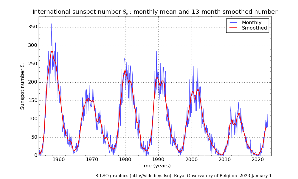
The Sunspot Index and Long-term Solar Observations (SILSO) Sunspot number graph showing six cycles is shown below. The data is from the Royal Observatory of Brussels. The Sunspot Cycle 24 has a smoothed sunspot number maximum of about 115 in 2014.

sunspot numbers from 1964

The monthly mean sunspot numbers and the centered 13-month average is shown. The data is here. The NOAA solar cycle image below is from here.

solar cycle sunspot number

A new model of the sun has produce unprecedentedly accurate predictions of the sun's variable solar cycles. The model uses two solar dynamos, one near the solar surface and one in the deeper in the convection zone. The model was described in a paper by Shepherd et al 2014 here and described here. The model predicts that solar activity will fall from cycle 24 activity by 60 per cent during the 2030s to conditions last seen during the 'mini ice age' that began in 1645.

Sun And Cosmic Rays

During the 20th century the Sun has continued to warm and may have contributed directly to a third of the warming over the last hundred years. The change in solar output is too small to directly account for most of the observed warming. However, the Sun-Cosmic Ray connection provides an amplification mechanism by which a small change in solar irradiance will have a large effect on climate.

A paper by H. Svensmark and E. Friis-Christensen of the Center for Sun-Climate Research of the Danish National Space Center in Copenhagen has shown that cosmic rays highly correlate to low cloud formation. Changes in the intensity of galactic cosmic rays alter the Earth's cloudiness.

An experiment in 2005 shows the effect of cosmic rays in a reaction chamber containing air and trace chemicals found over the oceans. Electrons released in the air by cosmic rays act as a catalyst in making aerosols. They significantly accelerate the formation of stable, ultra-small clusters of sulphuric acid and water molecules, which are the building block for the cloud condensation nuclei.

Danish scientists reported in May 2011 that they have succeeded for the first time in directly observing that the electrically charged particles coming from space and hitting the atmosphere at high speed contribute to creating the aerosols that are the prerequisites for cloud formation. In a climate chamber at Aarhus University, scientists have created conditions similar to the atmosphere at the height where low clouds are formed. This artificial atmosphere was irradiated with fast electrons from ASTRID Denmarks largest particle accelerator. The experiments show that increased radiation from cosmic rays leads to more aerosols. In the atmosphere, these aerosols grow into actual cloud nuclei in the course of hours or days. Water vapour concentrates on the nuclei forming small cloud droplets. See the paper here.

A team of 63 scientists published results in August 2011 of a much more sophisticated experiment which investigated the effects of cosmic rays on cloud formation. The CLOUD (Cosmics Leaving OUtdoor Droplets) experiment at CERN (European Organization for Nuclear Research) in Geneva show big effects of pions from an accelerator, which simulate the cosmic rays and ionize the air in the experimental chamber. The CLOUD experiment is the most rigorous test of the Cosmic Ray hypothesis yet devised. The experiments show that cosmic rays strongly enhance the formation rate of aerosols by up to ten fold, and confirms the earlier results from the Danish experiment. The aerosols may grow into cloud condensation nuclei on which cloud droplets form. See the CERN press release here.

The graph below shows the aerosol particle concentration growth in the CLOUD chamber. In an early-morning experimental run at CERN, starting at 03:45, ultraviolet light began making sulphuric acid molecules in the chamber, while a strong electric field cleansed the air of ions. As soon as the electric field was switched off at 04:33, natural cosmic rays raining down through the roof helped to build clusters at a higher rate. When CLOUD simulated stronger cosmic rays with a beam of charged pion particles starting at 4:58 the rate of cluster production became faster still. The various colours are for clusters of different diameters (in nanometres) as recorded by various instruments. The largest (black) took longer to grow than the smallest (blue). The CLOUD results also show that trace vapours assumed until now to account for aerosol formation in the lower atmosphere can explain only a tiny fraction of the observed atmospheric aerosol production.

CLOUD chamber aerosols

Coronal mass ejections from the sun cause a large decrease in the cosmic ray count, which are called Forbush decrease. These dramatic, short term cosmic ray decreases can be used to confirm the cosmic ray effects on clouds. The magnetic plasma clouds from solar coronal mass ejections provide a temporary shield against galactic cosmic rays.

A study by Svensmark et al in 2009 shows that the decrease in cosmic rays have a large effect on the amount of aerosols, cloud cover and the liquid water content of clouds. The authors conclude "From solar activity to cosmic ray ionization to aerosols and liquid-water clouds, a causal chain appears to operate on a global scale."

The figure below shows the evolution of fine aerosols particles in the lower atmosphere (AERONET), cloud water content (SSM/I), liquid water cloud fraction (MODIS), and low IR-detected clouds (ISCCP), averaged for the 5 strongest Forbush decreases in the period 1987-2007. The red dashed line shows the average cosmic ray count percent change. The lowest aerosol count occurs 5 days after the Forbush minimum, and the cloud water content minimum occurs 4 days later. The response in cloud water content for the larger events is about 7%.

The broken horizontal lines denote the mean for the first 15 days before the Forbush minimum of each of the four data sets.

Forbush decreases in the period 1987-2007
Source.

Data from the International Satellite Cloud Climatology Project and the Huancayo cosmic ray station shows a remarkable correlation between low clouds (below 3 km) and cosmic rays. There are more than enough cosmic rays at high altitudes, so changes in the cosmic rays do not effect high clouds. But fewer cosmic rays penetrate to the lower clouds, so they are sensitive to changes in cosmic rays.

  Cosmic Rays and Low Clouds

SvensmarkLowCloudComicRaySMALL.jpg

The blue line shows variations in global cloud cover collated by the International Satellite Cloud Climatology Project. The red line is the record of monthly variations in cosmic-ray counts at the Huancayo station.

Low-level clouds cover more than a quarter of the Earth's surface and exert a strong cooling effect on the surface. A 2% change in low clouds during a solar cycle will change the heat input to the Earth's surface by 1.2 watts per square metre (W/m2). This compares to the total warming of 1.4 W/m2 the IPCC cites in the 20th century. (The IPCC does not recognize the effect of the Sun and Cosmic rays, and attributes the warming to CO2.)

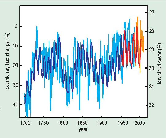
Cosmic ray flux can be determined from radioactive isotopes such as beryllium-10, or the Sun's open coronal magnetic field. The two independent cosmic ray proxies confirm that there has been a dramatic reduction in the cosmic ray flux during the 20th century as the Sun has gained intensity and the Sun's coronal magnetic field has doubled in strength.

  Cosmic Ray Flux Since 1700

Cosmic Ray Flux Since 1700

Changes in the flux of galactic cosmic rays since 1700 are here derived from two independent proxies, 10Be (light blue) and open solar coronal flux (dark blue) (Solanki and Fligge 1999). Low cloud amount (orange) is scaled and normalized to observational cosmic-ray data from Climax (red) for the period 1953 to 2005 (3 GeV cut-off). Both scales are inverted to correspond with rising temperatures. Note that high cosmic ray flux around 1700 is at the end of the Little Ice Age. Also note the increase in cosmic ray flux after 1780 at the time of the Dicken's Winters.

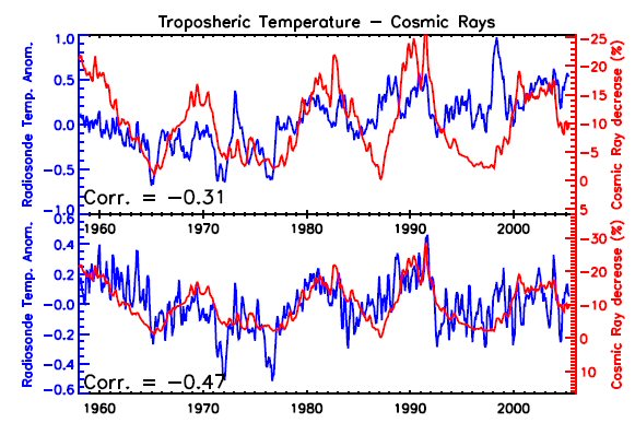
The graph below shows a correlation between the cosmic ray counts and the global troposphere temperature radiosonde data. The cosmic ray scale is inverted to correspond to increasing temperatures. High solar activity corresponds to low cosmic ray counts, reduced low cloud cover, and higher temperatures. The upper panel shows the troposphere temperatures in blue and the cosmic ray count in red. The lower panel shows the match achieved by removing El Nino, the North Atlantic Oscillation, volcanic aerosols and a linear trend of 0.14 degrees Celsius/decade.

troposphere temperature and cosmic rays

The negative correlation between cosmic ray counts and troposphere temperatures is very strong, indicating that the Sun is the primary climate driver. H. Svensmark and E. Friis-Christensen published the above graph in a paper October 2007 in response to a paper by M. Lockwood and C. Frohlich, in which they argue that the historical link between the Sun and climate came to an end about 20 years ago. However, the Lockwood paper had several deficiencies, including the problem that they used surface temperature data that is contaminated by the urban heat island effect (see below). They also fail to account for the large time lag between long-term solar intensity changes to the climate temperature response.

See Svensmark's rebuttal and Gregory's critique of the Lockwood paper.

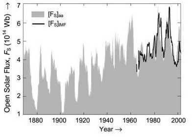
Over the 20th century the Sun has increased activity and irradiance intensity, directly providing some warming. The graph below from here shows the rising solar flux during most of the twentieth century.

  Open Solar Flux

Open Solar Flux

Dr. U.R. Rao of Bangalore, India, shows that galactic cosmic rays, using 10Be measurements in deep polar ice as the proxy, has decreased by 9% during the last 150 years. The decrease in cosmic rays cause a 2.0% decrease in low cloud cover resulting in a radiative forcing of 1.1 W/m2, which is about 60% of that due to the CO2 increase during the same period.

Rao_CR_HMF.jpg
Source.

In the top panel showing cosmic ray intensity, the continuous line represents estimated Climax neutron monitor counting rate (1956-2000), open circles denote ionization chamber measurements during (1933-1956) and filled circles represent cosmic ray intensity derived from 10Be (1801-1932). 10Be is a long-lived radioactive beryllium isotope produced by cosmic rays. The middle panel shows the near-Earth helio-magnetic field and the lower panel shows the sunspot number.

A reconstruction of the near Earth heliospheric magnetic field strength from 1900 through 2009 from here by Svalgaard and Cliver (2010) is shown below.

HMF1900-2009.jpg

The red curve are satellite direct measurements of the near-Earth heliospheric magnetic field (HMF) strength resulting from the solar wind. The blue curve is the Inter-Diurnal Variability (IDV) index calculated from the geomagnetic field observations one hour after midnight. The IDV is highly correlated with the near-Earth HMF. The green values are estimates of HMF by Lockwood et al 2009.

When the Sun is active it has a higher number of sun spots and emits more solar wind - a continuous stream of very high-speed charged particles. The increased solar wind and magnetic field repels cosmic rays that otherwise would hit the Earth's atmosphere, resulting in less aerosols in the lower atmosphere thereby reducing low cloud formation. The low clouds have a high reflectivity and have a strong cooling effect by reflecting sunlight back into space.

In summary, the process is:
More active Sun → more sunspots → more solar wind → less cosmic ray → less aerosols →
   ↪ less low clouds → more sun light to the surface → more global warming.

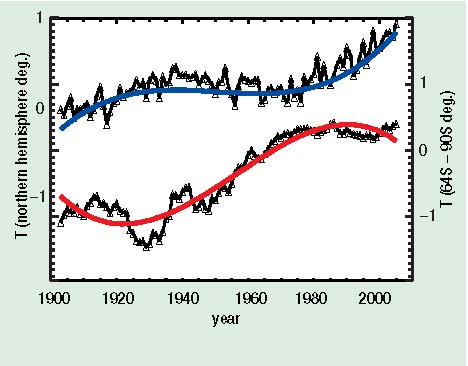
The theory of CO2 warming implies that the arctic and Antarctica should be warming about the same, and the polar regions should be warming more that the rest of the Earth. However, Antarctica has not warmed since 1975, which is a big problem for the CO2 theory. The ice covering Antarctica has even higher reflectivity than low clouds, so fewer low clouds cools Antarctica, while fewer low clouds warms the rest of the planet. (Greenland's ice sheet is much smaller and is not so reflective.) This Antarctica temperature trend is strong evidence that the Sun, not CO2, is the primary climate driver.

  Antarctica and North America Temperature Trends

Antarctica and North America Temperature Trends

The top curve is the North American surface temperature and the bottom curve is the Antarctica (64 S - 90 S) surface temperature over the past 100 years. The Antarctic data have been averaged over 12 years to minimize the temperature fluctuations. The blue and red lines are fourth-order polynomial fits to the data. The curves are offset by 1 K for clarity; otherwise they would cross and re-cross three times.

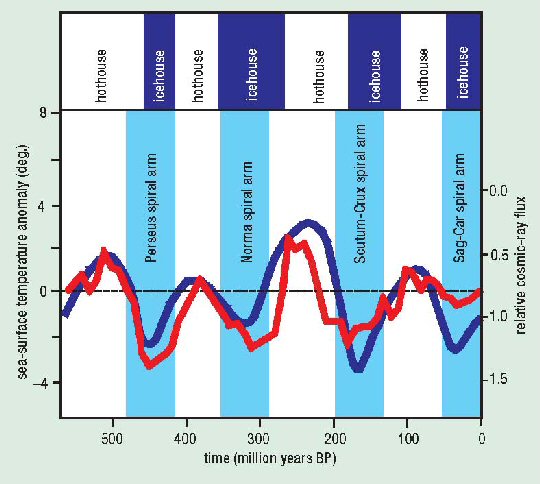
The cosmic ray flux is not only influenced by the solar wind, it also varies with the position of the solar system in the galactic arms. The solar system passes through the arms of the Milky Way galaxy roughly every 140 million years. When the solar system is in the galactic arms the intensity of cosmic rays increases, as we are closer to more supernovas that give off powerful bursts of cosmic rays. The variations of the cosmic ray flux due to the solar system passing through four arms of the Milky Way galaxy during the last 550 million years is ten times greater than that caused by the Sun. The correlation between cosmic rays and temperatures over 520 million years by N. Shaviv and J. Veiser was shown previously. Below is a similar graph based on their work, but with the times of the galactic arm crossings shown.

  Cosmic Ray Flux and Temperature Changes with Galactic Arm Crossings

Cosmic Ray Flux and Temperature Changes with Galactic Arm Crossings

Four switches from warm hothouse to cold icehouse conditions during the Phanerozoic are shown in variations of several degrees K in tropical sea-surface temperatures (red curve). They correspond with four encounters with spiral arms of the Milky Way and the resulting increases in the cosmic-ray flux (blue curve, scale inverted). (After Shaviv and Veizer 2003)

Temperature changes over this time range cannot be explained by the CO2 theory.

  CO2 Concentrations 500 million Years

CO2 concentration 500MM yr.JPG

The graph shows CO2 concentration over the last 500 million years. The CO2 does not correlate with temperature. Note that when CO2 concentrations were more than 10 times present levels, about 175 million years ago and 440 million years ago, the Earth was in two very cold ice ages.

Sources:
1. Cosmoclimatology: a new theory emergespaper by Henrik Svensmark, 2007
2. Celestial driver of Phanerozoic climate?paper by Shaviv and Veizer, 2003
3. Tim Patterson's National Post July 2003 review of the Shaviv and Veizer paper

Milankovitch Cycles

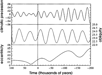
The Earth-Sun orbital changes are the principal causes of long term climate change. During the last 800,000 years, eight periods of glaciations have occurred. Each ice age lasts about 100,000 years with warm interglacial periods lasting 10,000 to 12,000 years. Milutin Milankovitch (1879-1958) identified three major cyclical variables which became recognized as the major causes of climate change. The amount of solar radiation reaching the Earth depends on the distance of the Earth to the Sun and the angle of incidence of the Sun's rays upon the Earth's surface. The Earth's axis tilt changes on a 40,000-year cycle, the precession of the equinox changes on a 21,000-year cycle, and the eccentricity of the Earth's elliptical orbit changes on a 100,000-year cycle.

The Earth's axis tilt (also known as obliquity of the ecliptic) changes from 22 to 24.5 degrees over a 40,000 year cycle. Summer to winter extremes are greater when the axis tilt is greater. The precession of the equinox refers to the Earth's wobble as it spins on its axis. Currently, the north axis points to the North Star, Polaris. In 13,000 years it would point to the star Vega, then return to Polaris in another 13,000 years, creating a 26,000-year cycle. When this is combined with the advance of the perihelion (the point at which the Earth is closest in its orbit to the Sun), it produces a 21,000-year cycle. The variation of the elliptical shape of the Earth's orbit around the sun ranges from an almost exact circle (eccentricity = 0.0005) to a slightly elongated shape (eccentricity = 0.0607) on a 100,000 year cycle. The Earth's eccentricity varies primarily due to interactions with the gravitational fields of other planets. The impact of the variation is a change in the amount of solar energy from closest approach to the Sun (perihelion, around January 3) to the furthest distant to the Sun (aphelion, around July 4). Currently the Earth's eccentricity is 0.016 and there is about a 6.4 percent increase in incoming solar energy from July to January. In the Northern Hemisphere, winter occurs during the closest approach to the Sun. The graph below shows the three cycles versus time. The vertical line represents the present, negative time is the past and positive time is the future.

orbital variation
Source.

Analysis of deep-sea cores shows sea temperature changes corresponding to these cycles, with the 100,000-year cycle being the strongest.

These solar cycles do not cause enough change in solar radiation reaching the Earth to cause the major climatic change without an amplifier effect. A plausible amplifier is the Sun's varying solar wind that modifies the amount of cosmic rays reaching the Earth's atmosphere.

The rate of change of global ice volume varies inversely with the solar insolation due to orbital changes. The graph below compares the June solar insolation anomaly north of 65 degrees latitude to the rate of change of global ice volume over the last 750,000 years. Reconstructions of global ice volumes rely on the measurement of oxygen isotopes in the shells of foraminifera from deep-sea sediment cores. The records also in part reflect deep ocean temperatures. Two ice records are shown; SPECMAP and HW04.

Ice_Insolation.gif

The ice melting and sublimation rates are very sensitive to summertime temperatures. The strong correlations and the absence of a large time lag demonstrate essentially concurrent variations in the change of ice volumes and summertime insolation in the northern high latitudes. Both ice volume reconstructions therefore support the Milankovitch hypothesis and show that the Sun is the dominant climate driver. The graph is from the 2006 paper "In defense of Milankovitch" by G. Roe.

Heating Of The Troposphere

Computer models based on the theory of CO2 warming predicts that the troposphere in the tropics should warm faster than the surface in response to increasing CO2 concentrations, because that is where the CO2 greenhouse effect operates. The Sun-Cosmic ray warming will warm the troposphere more uniformly.

The UN's IPCC fourth assessment report includes a set of plots of computer model predicted rate of temperature change from the surface to 30 km altitude and over all latitudes for 5 types of climate forcings as shown below.

  Computer Model Predicted Temperature Change

Computer Model Predicted Temperature Change
Source: Greenhouse Warming? What Greenhouse Warming? by Christopher Monckton.

The six plots show predicted temperature changes due to:
 a) the Sun
 b) volcanic activity
 c) anthropogenic CO2 and other greenhouse gasses
 d) anthropogenic ozone
 e) anthropogenic sulphate aerosol particles
 f) all the above forcings combined

The rate of temperature change is shown by the colour in degrees Celsius per century.

It is apparent that plot c) of warming caused by greenhouse gasses is strikingly distinct from other causes of warming. Plot f) is similar to plot c) only because the IPCC assumes that CO2 is the dominant cause of global warming.

The computer models show that greenhouse warming will cause a hot-spot at an altitude between 8 and 12 km over the tropics between 30 N and 30 S. The temperature at this hot-spot is projected to increase at a rate of two to three times faster than at the surface.

However, the Hadley Centre's real-world plot of radiosonde temperature observations shown below does not show the projected CO2 induced global warming hot-spot at all. The predicted hot-spot is entirely absent from the observational record. This shows that atmosphere warming theory programmed into climate models are wrong.

  HadAT2 Radiosonde Data 1979 - 1999

HadAT2 Radiosonde Data 1979-1999 scale
Source:p.116, fig. 5.7E, CCSP HadAT2 radiosonde observations, 2006.

The left scale is atmosphere pressure in hPa and the right scale is altitude in km. The colours represent -0.6 to 0.6 °C/decade.

The graph below compares the global annual temperatures of the troposphere to the surface measurements. The lower troposphere measurements from the University of Alabama in Huntsville (LT UAH v.6). It measures the temperature of the troposphere up to approximately 8 km. The HadCRUT5 curve is the Land and Sea-Surface Temperatures data set from UK Met Office. The GISS4 curve is the surface temperatures from the Goddard Institute of Space Studies. The three curves are scaled so that the trend lines equals 0 degrees Celsius in 1979. The graph shows the GISS4 and HadCRUT5 temperatures increasing at 0.19 °C/decade and the lower troposphere warming at only 0.132 °C/decade. All climate models forecast the lower troposphere warming faster than the surface due to increasing water vapour. The GISS climate model has the lower troposphere (weighted the same as the satellites) warming at 130% of the surface temperatures.

global annual temperatures of the troposphere and surface measurements

The graph below compares the annual temperatures of the troposphere to the surface measurements in the tropics. The lower troposphere data is from UAH6 and the surface data is from HadCRUT5 and GISS4. The latitude range for all three datasets is from 20 degrees North to 20 degrees South.

Tropical annual temperatures of the troposphere and surface measurements

A comparison of the records show that the surface has warmed faster than the troposphere, the opposite of what is predicted by the theory of CO2 warming. The GISS AF model warms the lower troposphere 30% faster than at the surface.

The predicted troposphere warming response in the tropics to global warming is the fingerprint of the hypothetical positive water vapour feedback that is programmed into the climate models.

The UAH analysis is from the University of Alabama in Huntsville. It uses microwave measurement from several satellites. The IPCC projections do not agree with the data.

Stratospheric Cooling

The graph "HadAT2 Radiosonde Data 1979-1999" in the previous section shows that the stratosphere (above 16 km) has cooled, which might appear to indicate a greenhouse gas effect. However, stratospheric cooling is predicted to occur due to both greenhouse gasses and ozone depletion. The ozone concentration in the stratosphere has declined from 1970 until 1995, and has not declined at all since then due to the implementation of the Montreal Protocol, which limits the emission of ozone reducing CFCs. The stratosphere temperatures shown below are from here.

lower stratosphere

The lower stratosphere temperature has not declined at all since 1995 (when the ozone levels are stable or slightly increasing), so the weather balloon data does not indicate any greenhouse gas cooling of the stratosphere. In fact, it appears that there has been a slight warming of the lower stratosphere since 1995, the opposite of what is predicted by computer models of the greenhouse gas effects. The stratosphere cooling indicated by the radiosonde data is caused by the changing ozone concentration, not by greenhouse gasses.

Below is a graph of lower stratosphere temperature from satellite data for the University of Alabama in Huntsville. It shows no change in temperature from 1994 through 2015, then a small drop in 2016. The two prominent peaks in 1982 and 1991 were caused by large volcanic eruptions.

Lower statosphere Temperature from UAH

CO2 Versus The Sun Warming Theories

The following table sets out a comparison of the predictions of two climate theories - the CO2 warming theory and the Sun/Cosmic Ray theory - and actual real world data.

Issue Prediction - CO2 Theory Prediction - Sun / Cosmic Ray Theory Actual Data Which Theory Wins
Antarctic and Arctic Temperatures Temperatures in the Arctic and Antarctic will rise symmetrically Temperatures will initially move in opposite directions Temperatures move in opposite directions Sun / Cosmic Ray
Troposphere Temperature Fastest warming will be in the troposphere over the tropics The troposphere warming will be uniform The surface warming is similar or greater than troposphere warming Sun / Cosmic Ray
Timing of CO2 and Temperature Changes at End of Ice Age CO2 increases then temperature increases Temperature increases then CO2 increases CO2 concentrations increase about 800 years after temperature increases Sun / Cosmic Ray
Temperature correlate with the driver over last 400 year na na Cosmic ray flux and Sun activity correlates with temperature, CO2 does not Sun / Cosmic Ray
Temperatures during Ordovician period Very hot due to CO2 levels > 10X present Very cold due to high cosmic ray flux Very cold ice age Sun / Cosmic Ray
Other Planets' Climate No change Other planets will warm Warming has been detected on several other planets Sun / Cosmic Ray


IPCC And Model Projections

Intergovernmental Panel on Climate Change (IPCC) presents projections of climate change, which are based on computer models. The Fifth Assessment Report (AR5) Working Group 1, "Climate Change 2013: The Physical Science Basis" was published online here on January 30, 2014. The projections given in the report are based on four scenarios, or Representative Concentration Pathways (RCP) which include different assumptions of CO2 and other greenhouse gas emissions. The names of the scenarios correspond to different target forcings at 2100 (compared to 1750), 2.6, 4.5, 6.0 and 8.5 W/m2. These RCPs replace the emission scenarios used in the fourth assessment report.

RCP2.6 is a strong mitigation scenario.
RCP4.5 is a mitigation scenario where radiative forcing is stabilized before 2100.
RCP6.0 is a slower mitigation scenario where radiative forcing is stabilized after 2100.
RCP8.5 is an extreme emissions scenario where greenhouse gas emissions rate increases.

The graph below shows the CO2 concentration in air to the year 2050 for each RCP scenario. The light blue curve is the historical CO2 concentrations.

IPCC_RCP_CO2.jpg

The CO2 concentrations of RCP2.6, RCP4.5 and RCP6.0 are similar up to 2030. RCP2.6 CO2 stabilizes shortly after 2040. The actual CO2 concentration increased at 0.54%/year from 2005 to 2013. The RCP8.5 CO2 concentrations increase at 1.00%/year by 2050, and at 1.16%/year by 2070, which is more than double the historical growth rate.

The IPCC's Sixth Assessment Working Group 1 Report "Climate Change 2021 The Physical Science Basis" was published August 2021. It replaces the RCP emissions scenarios with a new range of scenarios based on Shared Socio-economic Pathways. A scenario is a description of how the future may develop, based on a set of assumptions about key drivers including demography, economic processes, technological innovation and governance. These assumptions are combined with assumptions of mitigation actions to produce scenarios of emissions of greenhouse gases, aerosols and other climate drivers. Section 1.6.1 of WGI says "Scenarios are not predictions; instead, they provide a ‘what-if’ investigation of the implications of various developments and actions."

The emissions of CO2 by the five main scenarios are shown below. The emissions are from fossil fuel, industry (cement) and land use changes. They are in gigatonnes of CO2 per year (Gt/yr). The illustrative scenarios are referred to as SSPx-y, where ‘SSPx’ refers to the Shared Socio-economic Pathway or ‘SSP’ and ‘y’ refers to the approximate level of radiative
forcing (in W/m2) resulting from the scenario in the year 2100.

ssp CO2 emissions

The corresponding CO2 concentration, based on the climate models' average carbon cycle, is shown below in parts per million (ppm).

The methane (CH4) concentrations are shown below.

ipcc ssp ch4

Increasing human-caused greenhouse gas concentrations produce increasing radiative forcings in W/m2 at the top of the atmosphere compared to pre-industrial times.

ipcc ssp totat forcing


The SSP3-7.0 and SSP5-8.5 scenarios are extreme and unrealistic scenarios as both CO2 and CH4 concentrations increases much faster than the historical changes. While the 2nd number of the ssp scenario name is supposed to be the forcing at 2100, in fact the ssp4-6.0 has a 2100 forcing of only 5.14, much less than 6.0 W/m2. Ssp5-8.5 has a 2100 forcing of 8.70 W/m2.


  Global Mean Surface Temperature Change degrees Celsius

Below is a table of temperature projections from AR5.


Relative to 1986 to 2005

Relative to 2013

Scenario 2055 2090 2055 2090
RCP2.6 1.0 1.0 0.8 0.8
RCP4.5 1.4 1.8 1.2 1.6
RCP6.0 1.3 2.2 1.1 2.0
RCP8.5 2.0 3.7 1.8 3.5

The graph below from figure SPM.8 of AR6 WG1 Summary for Policy Makers shows the temperature projections to 2100. Very likely ranges are shown by shading for SSP1-2.6 and SSP3-7.0.

ipcc AR6 global surface tempemperature change to 2100 SSPs

Kevin Trenberth is head of the large US National Centre for Atmospheric Research and one of the advisors of the IPCC. Trenberth asserts ". . . there are no (climate) predictions by IPCC at all. And there never have been". Instead, there are only "what if" projections of future climate that correspond to certain emissions scenarios. According to Trenberth, GCMs ". . . do not consider many things like the recovery of the ozone layer, for instance, or observed trends in forcing agents. None of the models used by IPCC is initialised to the observed state and none of the climate states in the models corresponds even remotely to the current observed climate." However, Scott Armstrong and Kesten Green audited the relevant chapter in the IPCC's latest report. They find that "in apparent contradiction to claims by some climate experts that the IPCC provides 'projections' and not 'forecasts', the word 'forecast' and its derivatives occurred 37 times, and 'predict' and its derivatives occur 90 times" in the chapter. Consequently, it is not surprising that the public has this misimpression that the IPCC predicts future climate.

Computer Models Fail

The IPCC assumes that the Sun has little effect, even though observational evidence clearly shows the Sun has a significant effect on climate.

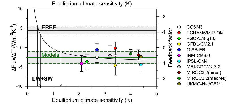
The models assume the 20th century temperature rise is caused by only greenhouse gas concentration increases, and parameters are set in the models to make the temperature rise in response to the greenhouse gas forcing. The direct effect of increasing CO2 concentration on global warming is very small. All the models amplify an initial increase in temperature due to CO2 by employing water vapour and clouds as a large positive feedback. However, there is no evidence that water vapour and clouds provides a large positive feedback. They may provide a negative feedback.

Climate models utilize large grid blocks to simulate climate, which are too large to include thunderstorms or hurricanes, so they use parameterization to account for these. These parameterizations ignore real-world transfers of energy, moisture and momentum that could significantly alter the results and severely limits the usefulness of climate model projections. Computer models employ approximations to represent physical processes that cannot be directly computed due to computational limitations. Because many empirical parameters can be selected to force a model to match observations, the ability of a model to match observations cannot be cited as evidence that the model is realistic and does not imply it is reliable for forecasting climate. See the Fraser Institutes Independent Summary For Policy Makers.

Methane is a significant greenhouse gas. From 1990 to 2019, methane's radiative forcing was 5.6% of that of CO2. Methane's concentration, as described below, was flat from 2000 to 2005 and started to increase again in 2006. The IPCC published the graph below showing the ranges of methane concentration forecasts of the assessment reports 1 to 4 along with the actual values. In each report the methane concentration forecasts were grossly overestimated. The actual values of methane were added in black for the period since AR5 was published and the AR5 RCP8.5 forecast.

Methane ipcc ar5 draft fi1.7

  Computer Model Temperature Trends versus Observations

Dr. John Christy, Professor of Atmospheric Science at the University of Alabama in Huntsville (UAH), say that the main job of a scientist is testing hypotheses. Since climate scientists bundle all their knowledge in climate models, the models need to be tested. The global average surface temperature is not suitable to test the models because they are already tuned to roughly match that. The most pronounced feature in all models is a strong warming in the upper tropical troposphere.

The bar graph below shows the warming trends of climate models and observations over the period 1979-2021 of the atmospheric layer in the tropics from 300 to 200 hPa pressure levels, which are 9 to 12 km altitude.

Tropical 300-200 hPa Trends of Models and Observation

The average trend of the climate models is 0.41 °C/decade and the average of the observations (weather balloon radiosonde and reanalysis data) is 0.17 °C/decade. The models over-warm the tropical atmosphere by a factor of 2.40. The Canadian model is the worst as the average warming trend of its two versions is 3.6 times the observations.

The graph below shows the 5-year means of the 1979 to 2021 tropical troposphere temperatures of the individual climate models, their average (model mean) and the observations by radiosonde, satellites and reanalysis.

Tropical Troposhere Trends of Models and Observations

The model mean trend is 0.32 °C/decade and the average of the three observation types (radiosondes, satellites and reanalysis) is 0.17 °C/decade. The model mean trend of the tropical troposphere is 2.03 times the observations’ average. The tropics are 20°S to 20°N and the troposphere is from the surface to about 16 km altitude. The variability of the climate models is 3 times larger than the observations indicating the models lack the negative feedback mechanisms operating in the real climate system. The graphs clearly show that the climate models are not fit for making climate policies.

A team of four researchers from three American universities led by David Douglass compared the troposphere temperature trends in the tropics predicted from climate models to actual satellite and radiosonde observations. In a paper published in December 2007 by the Royal Meteorological Society, Douglass et al analysed the simulation results from 22 climate models at the surface and at 12 different altitudes. The simulation results were compared to the temperature trends determined from two analysis of satellite data and four radiosonde datasets for the period January 1979 through December 2004.

Climate model comparisons

The above diagram shows the comparison of temperature trends from 1979 through 2004 of climate models and actual satellite and radiosonde observations, expressed as degrees Celsius per decade versus altitude and atmospheric pressure. The left panel shows four radiosonde results as IGRA, RATPAC, HadAT2 and RAOBCORE. The thick red line shows the mean of the 22 computer model results and the models' 2 times standard error of the mean are shown as the two thin red lines. Temperature trends from three surface measurement datasets are identified in the legend by Sfc and are plotted on the left axis. The RSS and UAH analysis of satellite data are plotted on the right panel at two effective layers: T2lt represents the lower troposphere with a weighted mean at 2.5 km, T2 represents the mid troposphere with a weighted mean at 6.1 km altitude. A trend is the slope of the line that has been least-squared fit to the data. Synthetic model values corresponding to the effective layers of the satellite data are shown in the right panel as open red circles.

An essential place to compare observations with greenhouse computer models is the layer between 450 hPa and 750 hPa atmospheric pressure where the presence of water vapour is most important, and is called the "characteristic emission layer". In this layer, the observations are all outside the 2 times standard error test. The radiosonde and satellite trends are inconsistent with the model trends at all altitudes above the surface. Douglass et al. conclude that Model results and observed temperature trends are in disagreement in most of the tropical troposphere, being separated by more than twice the uncertainty of the model mean. In layers near 5 km, the modelled trend is 100 to 300% higher than observed, and, above 8 km, modelled and observed trends have opposite signs. Therefore any projections of future climate from the models are very likely too high, and these projections should not be used to form public policy. See the paper "A comparison of tropical temperature trends with model predictions".

A technical paper published by R. McKitrick, S. McIntyre and C. Herman in Atmospheric Science Letters, August 2010 shows that the climate model temperature trends of the mid-troposphere, using 57 runs from 23 climate models, are four times larger than observations from satellites and weather balloons.

mid-troposphere warming vs models Source.

Dr. Roy Spencer posted the following graph comparing 73 climate model runs versus weather balloon and satellite observations in the tropical mid-troposphere. The plotted balloon and model runs are simulated satellite profiles.

Spencer models epic fail

Dr. Roy Spencer writes "Now, in what universe do the above results not represent an epic failure for the models?" here. "I frankly don’t see how the IPCC can keep claiming that the models are “not inconsistent with” the observations. Any sane person can see otherwise." See here. John Christy writes "All pressure levels are used in the radiosondes and models to generate the simulated satellite profile. All levels are used according to their proportional weighting of the [satellite] microwave emission function."

While air temperature may fluctuate from year to year as heat is transferred between the air and oceans, if CO2 is causing global warming by the IPCC hypothesis, the ocean heat content must increase monotonically provided there are no major volcanic eruptions. Ocean heat content is a much more robust metric than surface air temperature for assessing global climate change because the ocean's heat capacity is greater than that of the atmosphere by many orders of magnitude. For any given area on the ocean surface, the upper 2.6 m of water has the same heat capacity as the entire atmosphere above it! According the IPCC models, all major feedbacks are positive so there is no mechanism that would allow the heat content of the Earth to decline.

Heat accumulating in the climate system can be measured on a global scale from 2003 by the ARGO array of 3341 free-drifting floats that measure temperature and salinity in the upper 2000 m of ocean. The robotic floats rise to the surface every 10 days and transmit data to a satellite which also determines their location as shown below.

ARGO array

The graph below shows the ocean heat content from NOAA by ocean depth layer; 0 to 700 m depth and 0 m to 2000 m depth.

global ocean heat content by layer

The more heat that is transferred into the deep ocean, the less heat is left to warm the atmosphere. The graph above shows that both the layers has been gaining heat. The NOAA data for 0 to 2000 m from here starts in Q1 of 2005. The difference between the curves is the heat gain from 700 m to 2000 m depth. The graph displays the heat content anomalies, not the actual heat content, so only the heat changes are relevant. The units of heat content of Joules is not very meaningful to most people, so the graph below presents similar information but in average temperature change for each layer. The graph shows the 0 to 700 m and the 0 to 2000 m temperature data from Q1 of 2003, which is usually considered the start of reliable ARGO data.

Global ocean temperature by layer

The smooth, thin lines are the quadratic best fit lines. Data point are every quarter year. The temperature of the 0-700 m ocean layer is increasing a little faster than the 0-2000 m layer and it indicates a greater acceleration of temperatures. The 0 to 2000 m layer temperature rise is almost linear and shows very little acceleration. The temperature trend of the 0-700 m layer at the middle of 2022 was 0.112 °C/decade. The trend of the 0 to 2000 m layer at the middle of 2022 is 0.052 °C/decade, or about half of the 0 to 700 m layer.


One of the most important parameters in determining climate sensitivity in climate models is the amount of heat they transfer to the oceans. The following graph by Dr. Spencer compares the Levitus observations of ocean warming trends during 1955-1999 to 15 IPCC 4AR climate model runs.

Global ocean temperature trend
Source.

Note that the climate models exhibit wildly different trends, with the deep ocean cooling just as often as warming. The green curve is the Levitus actual observation to a depth of 700 m. Most of the models produce too much warming in the layer to 700 m. Many models produce unexpected ocean cooling below 100 m while the surface warms. None of the models even remotely match the observations. The weak ocean warming in the 700 m layer suggests low climate sensitivity, even if all the warming was due to CO2 emissions.

The graphs below in this section prepared by Bob Tisdale compare temperature series to hindcasts of computer models used by the IPCC. Computer model hindcasts should be compare to the actual historical observations to determine how well the models matched the historical record. A model that fails to history match will not produce realistic projections.

The animation below compares observed North Atlantic temperature anomalies to the modeled surface air temperatures for the 6 individual ensemble members and the ensemble mean of the National Center of Climate Research (NCCR) coupled climate model CCSM4. All data have been smoothed with a 121-month filter.

North Atlantic temperature anomalies to the modeled surface air temperatures

Bob Tisdale writes "The NCAR CCSM4 coupled climate model appears to do a poor job of hindcasting the multi-decadal variability of North Atlantic temperature anomalies." See here.

The animation below compares the sea surface temperature (SST) in the NINO 3 region to the climate model hindcasts. NINO 3 is a region in the Eastern Pacific tropics where El Nino events occur. It shows how poorly the models hindcast the frequency, magnitude, and trend of ENSO events. The model ensemble mean trend is 14 times greater than the trend of the observations.

sea surface temperature (SST) in the NINO 3 region to the climate model hindcasts

Bob Tisdale writes "the frequency and magnitude of El Nino and La Nina events of the individual ensemble members do not come close to matching those observed in the instrument temperature record. Should they? Yes. During a given time period, it is the frequency and magnitude of ENSO events that determines how often and how much heat is released by the tropical Pacific into the atmosphere ..."

The graph below compares the linear trends for the observations and the model mean of the IPCC AR5 hindcasts/projections of SST for the period of January 1982 to December 2014 in 5-degree-latitude bands. The models predicted much greater warming trends in the tropics than what was observed. The actual warming in the northern regions is greater than modeled. Warming was predicted in the southern region but the SST trend was actually negative in much of the region. This shows that the models do an extremely poor job at simulating how topical heat is transported to the Polar Regions. See here.

linear trends for the observations and the model mean by latitude

The sea surface temperatures from -50 to -80 degrees latitude (south) and from 50 to 80 degrees latitude (north) are shown below. The IPCC claims that CO2 is the main driver of climate change, but the best fit linear temperature trends declined at 0.04 °C/decade in the southern region and increased at 0.22 °C/decade in the northern region despite the fact that CO2 concentrations in the two regions are almost the same.

sea surface temperatures from -55 to -80 degrees latitude (south) and from 55 to 80 degrees latitude (north)

The graph below compares the Eastern Pacific SST to models by latitude. This includes the important El Nino region so a good history match here is critical. The Eastern Pacific tropical SST has declined at the equator at 0.14 C/decade, but the models show a strong warming of 0.19 C/decade. See here.

Eastern Pacific SST to models by latitude

The graph below compares SST observations to climate model outputs for the period of 1910 to August 2011. The SST is from the HADISST dataset and the model hindcast is the IPCC model mean published in 2007. The models do not match the temperature variability in the period 1910 to 1975. They are made to match the warming trend from 1975 to 2002 by assuming most of the warming is due to CO2 and using high sensitivity to greenhouse gases. The projections diverge from observations after 2002 despite the continued increase in CO2 emissions. See here.

SST observations to climate model

The graph below shows the northern hemisphere sea surface temperature measurements and the climate model hindcasts for the period 1910 to 1944. The actual temperature rise was 4.5 times greater than the modeled trend. The models cannot replicate the measurements because they do not include natural causes of climate change. The graph is from here.

northern hemisphere sea surface temperature measurements and the climate model

The global surface temperature trend from HadCRUT for the early 20th century warming period 1917 to 1944 at 0.174 °C/decade is similar to the late warming period 1976 to 2005 at 0.195 °C/decade as shown below. But the net anthropogenic forcing in the climate models during the late warming period is 3.8 times higher than the forcing during the early warming period. The 3.8 fold increase in forcing had almost no effect on the temperature trends of the two warming periods, indicating that the theory of anthropogenic global warming is seriously flawed. The graph from here.

global surface temperature trend from HadCRUT two periods

The graph below compares the 17-year (240 months) trends of the global SST to the IPCC model mean. Each point on curves represents the 17-year straight-line best-fit trend to that point in time. The IPCC models projected the global 17-year SST trend ending August 2011 at 0.15 °C/decade, but the observed rise was only 0.02 °C/decade. See here.

17-year (240 months) trends of the global SST

Bob Tisdale writes, "The coupled climate models used to hindcast past and project future climate in the IPCC 2007 report AR4 were not initialized so that they could reproduce the multi-decadal variations that exist in the global temperature record. This has been known for years." and "The climate models used by the IPCC appear to be missing a number of components that produce the natural multi-decadal signal that exists in the instrument-based Sea Surface Temperature record."

The daily temperature range over land has been decreasing because the daily minimum temperatures (Tmin) has increased more than the daily maximum temperatures (Tmax) over the 20th century. The NOAA Global Historical Network database shows that 2/3 of the warming is due to the increase in the minimum temperatures. The trend of the difference between the maximum and minimum daily temperatures is called the Diurnal Temperature Range and it is a very important climate parameter. A paper by McNider et al (2012) shows that 6 climate models with published minimum and maximum temperatures replicate only 20% of the measured diurnal temperature trend as shown in the figure below. This is a five-fold climate model error.

The daily temperature range over land

Climate models are tuned to match only the 1970 to 2000 temperature rise of the average of the minimum and maximum temperatures (Tmean). If models are replicating Tmean but are not capturing the trend in Tmin, then this must mean that the model Tmax is warming faster than the actual Tmax. A computer analysis of the near surface boundary layer shows that an increase in greenhouse gases causes increased mixing of the boundary layer which brings warm nighttime air aloft down to the surface. Only 20% of the warming was due to longwave energy in the model simulation and 80% was due to increased turbulence. A layer only 20 to 50 m in thickness is warmed by this turbulence. The Tmax measured during the daytime represents a boundary layer 1 to 2 km deep. The climate models assume the Tmean represents an air thickness of 1 to 2 km, but it is actually only 20 to 50 m thick. The modeled Tmax is warming much faster and represents a much greater air thickness than the actual Tmax. See here.

Most of the warming in climate models is due to increasing water vapour as temperatures rise. The climate models greatly overestimate the Tmax trend, which represents the deep atmosphere, so they greatly overestimate the increase in water vapour in the lower atmosphere as well.

About 46% of human-caused CO2 emissions including land use changes remain in the atmosphere and 54% are absorbed by natural sinks. The graph below shows that the fraction of emissions that remains in the atmosphere hasn't changed since 1970.

Airborne fraction of CO2

Most of the models forecast the airbore fraction will increase so that the CO2 concentration in the atmosphere will rise by an additional 50 to 100 ppm by 2100 compared to a constant airborne fraction. But the actual airborne fraction change is insignificant since 1970. A paper that discusses the climate model airborne fraction forecasts is here. The annual CO2 concentration data from Mauna Loa is here.The annual CO2 emissions data for 1751-2014 is here and to 2020 in Excel format can be found here.

Many important inputs to climate models are very uncertain and real world observational evidence does not support them, so it is foolish to rely on their projections to make expensive policy decisions.

A scorecard listing the success of models is here.

Water Vapour Feedback

Relative humidity is the fraction of water vapour in a small parcel of air relative to the total amount of water vapour the air could contain at the given temperature and pressure. All the General Circulation Models, also known as Global Climate Models (GCM), just set various evaporation and precipitation parameters to achieve approximately the result: Relative humidity = constant.

Box 8.1 of 4AR Chapter 8 page 632 states:

The radiative effect of absorption by water vapour is roughly proportional to the logarithm of its concentration, so it is the fractional change in water vapour concentration, not the absolute change, that governs its strength as a feedback mechanism. Calculations with GCMs suggest that water vapour remains at an approximately constant fraction of its saturated value (close to unchanged relative humidity (RH)) under global-scale warming (see Section 8.6.3.1). Under such a response, for uniform warming, the largest fractional change in water vapour, and thus the largest contribution to the feedback, occurs in the upper troposphere.

The assumption of constant relative humidity is not correct. Here is a graph of global average annual relative humidity at various elevations in the atmosphere expressed in millibars (mb) from 300 mb to 700 mb for the period 1970 to 2022. [Standard atmospheric pressure = 1013 mb. 1 mb = 1 hectopascal (hPa)] The data is from the NOAA Earth System Research Laboratory here.

Global relative humidity

This graph shows that the relative humidity has been dropping to about 2012, especially at higher altitudes allowing more heat to escape to space. The curve labelled 300 mb is at about 9 km altitude, which is in the middle of the predicted (but missing) tropical troposphere hot-spot. This is the critical elevation as this is where radiation can start to escape without being recaptured. The average relative humidity at this altitude has declined from 1970 to 2012 then increased to 2022! The decline from 1970 to 2022 was 9.3% (or 4.1 percentiles).

This is no logical reason to expect relative humidity to remain constant with increasing CO2 above the cloud layer. Relative humidity in a cloud is exactly 100% because the water droplets that make up the cloud are in equilibrium with the air. Likewise, relative humidity immediately above the oceans is 100%. The relative humidity in air parcels moving up over mountains will increase up to 100% causing rainfall. This saturation limit controls the average humidity in the atmosphere up to the top of the cloud layer. But the relative humidity at 400 mbars averages only 37% globally, or 31% in the tropics, and rarely gets anywhere near the saturation limit except in high thunderstorm clouds. The saturation limit therefore plays little role in determining the water vapour content of the upper atmosphere.

Doubling the amount of CO2 would increase temperatures by only about 1 degree Celsius if nothing else changed according to the IPCC. But the amount of water vapour will change in response to a CO2 induced temperature increase. Warmer air can hold more water vapour, so if relative humidity remains constant, the amount of water vapour increases with increasing temperatures. More water vapour, being a powerful greenhouse gas, would cause a further temperature increase, which is called a positive feedback. Most of the IPCCs projected warming is due to this water vapour feedback.

But the above graph shows falling relative humidity where the IPCC says changing water vapour content is most important. If relative humidity declines with increasing CO2 concentrations, the amount of water vapour in the upper troposphere may not increase, but might decline instead, resulting in a negative water vapour feedback.

Here is a graph of specific humidity, or the actual water vapour content, in grams of water vapour per kilogram of air, at the 400 mb level (about 8 km altitude).

specific humidity 400 mb

This shows that the actual water vapour content in the upper troposphere has declined to 2012 then increased through 2020. The climate models predict that humidity will increase in the upper troposphere, but the data shows a large decrease until 2012; just where water vapour changes have the greatest effect on global temperatures. It is unknown why there was a dramatic change in the slope at about 2012.

The NASA water vapour project (NVAP) uses multiple satellite sensors to create a standard climate dataset to measure long-term variability of global water vapour. The Heritage NVAP merges data from several satellites and radiosonde water vapour products for the years 1988 to 2001. The graph below left was presents at the GEWEX/ESA Due GlobVapour workshop March 8, 2011 here. Water vapour content of an atmospheric layer is represented by the height in millimeters (mm) that would result from precipitating all the water vapour in a vertical column to liquid water.

zonal water vapour 500 to 300 hPa

The graph shows a significant decline in global water vapour in the atmosphere layer from 500 to 300 hPa, about 6 to 9 km altitude.

Animation water vapour

The animation above shows the amount of water vapour over the earth in the 500 to 300 mbar pressure layer. The Heritage NVAP global water vapour data (1988 to 2001) by layer is available from a NASA website here.

The global annual average precipitable water vapour by atmospheric layer and by hemisphere is shown in the follow graph.

precipitable water vapour by layer

The graph is presented on a logarithmic scale so the vertical change of the curves approximately represents the forcing effect of the change. The water content of the L1 layer, surface to 700 mb, is about 20 times greater than in the L3 layer, 500 to 300 mb, whereas the forcing effect of a change in the L3 is approximately 14.5 times the same change in the L1. Water vapour changed from 1990 to 2001 by -0.55 mm for L3, -0.57 mm for L2 and +1.73 mm for L1. The decrease in L3 is equivalent to an 8 mm reduction in L1. The water vapour decline in the L2 and L3 layers overwhelms the forcing effect of the water vapour increase in the L1 layer, so the water vapour feedback is negative. The upper atmosphere (L2 and L3) water vapour content of the southern hemisphere is less than, and has declined more than the water vapour content of the northern hemisphere.

PWV by layer 1991

The above graph shows the precipitable water vapour by layer versus latitude by one degree bands. The highest water vapour content at each atmospheric layer occurs near the equator.

Dr. Ferenc Miskolczi performed computations using the HARTCODE line-by-line radiative code to determine the sensitivity of the out-going long-wave radiation (OLR) to a 0.3 mm change in precipitable water vapour in each of 5 layers of the NVAP-M project. Note that a 0.3 prmm of water vapour is equivalent to 0.3 kg/m2 of water. The change of OLR for each layer is the difference between a reference case and a case with an additional 0.3 prmm ow water vapour in that layer. The reference case has 410 ppmv of CO2 in all layers and up to 70 km altitude. THe amount of water vapour in each layer up to 300 mbar is the average over 1970 to 2018 from the NOAA NECP1 dataset, and from the TIGR2 radiosonde dataset above 300 mbar.

Sensitivity of water vapour change on OLR

The results show that a water vapour change in the 150-100 mbar layer has 284 times the effect on OLR than the same change in the 1013-1000 mbar near-surface layer. A water vapour change in the 300-250 mbar layer has 149 times the effect on OLR than the same change in the 1013-1000 mbar near-surface layer.

The table below shows the precipitable water vapour for the three layers of the Heritage NVAP and the CO2 content for the years 1990 and 2001, and the change.

Layer
 
L1 near-surface
1013-700 mbar
L2 middle
700-500 mbar
L3 upper
500-300 mbar
Sum
L1+L2+L3
CO2
 
1990 18.99 mm 4.6 mm 1.49 mm 25.08 mm 354.16 ppmv
2001 20.72 mm 4.03 mm 0.94 mm 25.69 mm 371.07 ppmv
change +1.73 mm -0.57 mm -0.55 mm +0.61 mm +16.91 ppmv

Calculations show that the cooling effect of the water vapour changes on OLR is 16 times the warming effect of CO2 during this 11-year period. The cooling effect of the two upper layers is 5.8 times the warming effect of the lowest layer.

These results highlight the fact that changes in the total water vapour column, from surface to the top of the atmosphere, is of little relevance to climate change because the sensitivity of OLR to water vapour changes in the upper atmosphere overwhelms changes in the lower atmosphere. See here.

The NVAP-M project extends the analysis to 2009 and reprocesses the Heritage NVAP data.

The global total precipitable water vapour column from here is given below. Climate models assume that water vapour increases with increasing CO2 concentrations, but the NVAP-M data, using the best available satellite data, shows no increase in the total water vapour column.

global total precipitable water vapour

The most obvious way to determine the water vapour feedback due to CO2 changes, i.e. the effect that CO2 changes have on upper atmosphere water vapour, is to plot the annual water vapour specific humidity versus CO2 concentrations. Annual data is used to eliminate the seasonal signal. The climate models show that the maximum predicted water vapour feedback is at about the 400 mbar pressure level, which is in the predicted but missing tropical troposphere hot spot as shown in the Heating of the Troposphere section above.

It has been suggested that the early NOAA Earth System Research Laboratory data is unreliable due to poor coverage and calibration issues. Water vapour in air immediately above the ocean is in equilibrium with the water, so the air is near 100% relative humidity, regardless of the temperature. Water vapour over land is expected to vary proportionally with water vapour over the oceans, resulting in a near constant global average relative humidity near the surface with global warming. Data before 1960 is considered less reliable because the surface relative humidity is too high and would result in a declining relative humidity trend. The graph below shows the relative humidity near the surface at 1000 mbar pressure from the NOAA database from 1960 to 2014. The best fit trend line shows no trend confirming that the NOAA water vapour data from 1960 has no drying bias near the surface. Therefore, we use only the data from 1960 in the analysis.

RH near the surface

The graph below shows the annual specific humidity at the 400 mbar pressure level by three latitude bands. Note that in the tropics there is a significant drying trend. There is very little trend in either the northern or southern mid-latitude regions.

SH at 400 mb by latitude range

The graph below shows the global average annual specific humidity at the 400 mbar pressure level versus CO2 concentration from 1960 to 2021.

SH400vsCO2.jpg

The blue line shows that as CO2 increases, water vapour decreases, which is opposite to climate model predictions. The brown line shows what the specific humidity would have been at the actual measured temperature assuming the relative humidity was held constant at the 1960 value.

The graph below shows the annual specific humidity in the tropics from 30 degrees North to 30 degrees South latitude at the 400 mbar pressure level versus CO2 concentration from 1960 to 2021. This is in the middle of the predicted but missing tropical hot spot.

SH400TropicsVsCO2.jpg

Note the greater discrepancy between the actual data and the constant relative humidity assumption in the tropics versus the discrepancy for the global average. The brown line shows what the specific humidity would have been assuming a constant relative humidity. The actual climate model projections would show a much greater increase in specific humidity than indicated by the brown line because the climate models, in addition to the incorrect constant relative humidity assumption, also project the temperature increase in the upper atmosphere to be four times greater than the actual temperature trend determined by radiosonde and satellite measurements.

To compare this correlation to the climate model assumptions, the following graph shows the annual specific humidity in the tropics from 30 degrees North to 30 degrees South latitude at the 400 mbar pressure level versus temperature from 1960 to 2013. The climate models assume that water vapour changes only in response to a temperature change. If this were true, this graph should show a very strong correlation of increasing humidity with temperature. The graph is a phase space plot of the data points connected in time sequence. Over short time periods, an increase in temperature causes an increase in specific humidity. The annual data shows linear striations increasing from bottom left to top right, confirming that higher temperatures relate to higher specific humidity over short time intervals. But the overall trend is down, proving that specific humidity in the upper atmosphere declines with increasing temperatures over longer time scales.

specific humidity 400 mb vs temperature tropics

The graph not only shows a very poor correlation of specific humidity to temperature at the 400 mbar pressure level, but the trend is negative rather than strongly positive as assumed in the climate models. Increasing CO2 would initially cause a slight warming before considering a water vapour or cloud response. In climate models this warming causes an increase in upper atmosphere water vapour because the models assume that water vapour can only change in response to a temperature change. But the data shows that water vapour declines with increasing CO2 at a R2 correlation of 0.73 and shows that water vapour declines with temperature at a R2 correlation of only 0.027. Obviously specific humidity is not only responding to temperature changes. In the long-term, factors other than temperature determine upper atmosphere humidity. Temperature has little effect on the long-term upper atmosphere specific humidity contrary to climate model assumptions. CO2 emissions are causing a decline in upper atmosphere water vapour thereby allowing heat to escape to space. We believe that the long-term specific humidity in the upper atmosphere is determined by the maximum entropy principle, not temperature. The atmosphere is able to maximize the loss of heat to space subject to the constraint of the saturation limit in the lower atmosphere by decreasing the water vapour content in the upper atmosphere in response to increasing CO2 concentrations.

The NOAA humidity data is here in Excel format.

The graph below compares the IPCC AR5 hindcast/forecast multi-model mean to the NOAA total precipitable water vapour column anomaly. It also shows that water vapour changes lag behind ENSO by about 3 months. The graph is from a blog comment by Bill Illis here.

ENSO lagged 3 month vs water vapour

The AGW theory is essentially the idea that an increase in CO2 will cause water vapour to increase causing an enhanced greenhouse effect. The graph shows that the models roughly agrees with observation to 1984, then the models significantly over estimates the total water vapour content of the atmosphere. The modellers apparently make no attempt to match observations after 1984.

Greenhouse gases absorb long-wave radiation, making the atmosphere opaque at those wave lengths. Dr. Ferenc M. Miskolczi has developed a program called High-resolution Atmospheric Radiative Transfer Code (HARTCODE) that uses thousands of measured absorption lines and is capable of doing accurate radiative flux calculations. The calculations are independent of any greenhouse theory and contain no assumptions on how the greenhouse effect works, other than the fact that greenhouse gases absorb and emit radiation.

Water vapour is the most important greenhouse gas. HARTCODE simulations show that a 10% increase in CO2 concentration has the same effect as a uniform 1.80% change in water vapour on the out-going longwave radiation (OLR). A uniform 1% change in water vapour has 5.4 times the effect that a 1% change in CO2 has on OLR. A doubling of CO2 can be offset by a 12.3% reduction in H2O. This is shown in the following graph.

H2O&CO2_OLR.jpg

The radiation balance is determined at the top of the troposphere. The HARTCODE was used to determine the effect of changes of water vapour at the upper atmosphere versus near the surface. The graph below shows that changing the water vapour content in an atmospheric layer from the 300 mb to the 400 mb level has 30 times the effect on out-going long-wave radiation (OLR) as the same small change near the surface. So water vapour changes in the upper atmosphere are more important than changes in the lower atmosphere.

Effect of H2O by altitude on OLR

Optical depth is a measure of how opaque the atmosphere is to long-wave radiation, and so is a measure of the strength of the greenhouse effect. Miskolczi used HARTCODE to compute the optical depth from 1948 to 2008 using the measured CO2 content at Mauna Loa, Hawaii and the global average water vapour content from the NOAA Earth System Research Laboratory. The optical depths are calculated for each greenhouse gas and summed line-by-line across the electromagnetic spectrum. The resulting optical depth curve is a measure of the total greenhouse gases by effect over the last 61 years. The result is given below.

Optical depth change

The blue line of the graph shows the optical depth of the atmosphere with changing CO2 and water vapour content. The green line is the linear trend of this data which indicates an insignificant trend. The pink line is the effect of increasing CO2 with water vapour held constant. It shows a small upward trend. The difference of these trends is the water vapour feedback. Recall that the IPCC assumes that water vapour provides a large positive feedback, which implies that the green line would be increasing much steeper than the pink line. The HARTCODE results shows the opposite. It shows a large negative feedback, where the changing water vapour offsets most of the warming effect of CO2.

The results show that the total effective amount of greenhouse gasses in the atmosphere has not significantly increased over the last 60 years.

The IPCC claims that the warming over the last half century was due to an increase in the quantity of greenhouse gases in the atmophere. But the HARTCODE result shows that CO2 replaces water vapour as a greenhouse gas, so it can't be responsible for global warming.

Here is the GCM error of specific humidity as reported by the IPCC's 4AR, Chapter 8-Suppl page 54:

specific humidity model error

This chart shows the multi-model mean fractional error, expressed as a percent (i.e., simulated minus observed, divided by observed and multiplied by 100). The observational estimate is from the 40-year European Reanalysis (ERA40, Uppala et al., 2005) based on observations over the period 1980-1999. The model results are from the same period of the CMIP3 20th Century simulations.

Note that the chart shows that the model's errors in specific humidity at the altitude where the largest contribution of the feedback is predicted to occur is between 20% to 400 too high! If the specific humidity were corrected in the models at this critical altitude, the positive feedback would change to a strong negative feedback.

The strength of the greenhouse effect is undetermined in the current theory utilized by climate models. Parameters are just set to match the current temperatures. A new greenhouse effect theory by Ferenc Miskolczi shows that the current greenhouse effect equations are incomplete because they do not include all the necessary energy constraints. When these constraints are included in a new theory, the strength of the GHE is determined analytically. The new theory presented in Miskolczi's paper shows that the atmosphere maintains a saturated greenhouse effect, controlled by water vapour content. There is a near infinite supply of greenhouse gases available to the atmosphere in the form of water vapour from the ocean to provide the greenhouse effect, but the atmosphere takes up only a portion of the water vapour it could hold due to energy balance constraints. Adding CO2 to the atmosphere just replaces an equivalent amount of water vapour to maintain an almost constant greenhouse effect and has negligible effect on global temperatures. See here for more information.


Cloud Feedback

cloud

Climate models are limited by our understanding of cloud formation. While scientists have a basic understanding of cloud formation, the details controlling how bright they are, how dense and how large they become is poorly understood. We lack the detailed understanding of clouds required to make accurate climate models. Clouds have a major role in climate by reflecting sunlight back into space, trapping heat, and producing precipitation.

As the Earth warms, there is more evaporation from the oceans, therefore more water vapour in the atmosphere available for cloud formation. But low clouds reflect sunlight back into space resulting in a strong cooling effect, negating most of the initial temperature increase.

Researchers at the University of Alabama in Huntsville (UAH) reported in August 2007 that individual tropical warming cycles that served as proxies for global warming saw a decrease in the coverage of heat-trapping [high altitude] cirrus clouds, says Dr. Roy Spencer, a principal research scientist in UAH's Earth System Science Center.

"All leading climate models forecast that as the atmosphere warms there should be an increase in high altitude cirrus clouds, which would amplify any warming caused by manmade greenhouse gases," he said. "That amplification is a positive feedback. What we found in month-to-month fluctuations of the tropical climate system was a strongly negative feedback. As the tropical atmosphere warms, cirrus clouds decrease. That allows more infrared heat to escape from the atmosphere to outer space."

"While low clouds have a predominantly cooling effect due to their shading of sunlight, most cirrus clouds have a net warming effect on the Earth," Spencer said. With high altitude ice clouds their infrared heat trapping exceeds their solar shading effect. If computer models incorporated this enhanced cooling effect due to such a reduction of high clouds, "it would reduce estimates of future warming by over 75 percent," Spencer said.

A review of Dr. Spencer's paper is in ScienceDaily here and the paper is available here.

The modellers only do crude analysis of feedback from satellite data. They observe that low clouds tend to decrease with warming and assumed that the warming caused the low clouds to decrease. But cloud changes also cause temperatures to change. When a cloud moves to block the Sun, temperatures fall. The amount of clouds can change in response to a general ocean circulation change. So cloud changes are sometimes a cause of temperature change, and sometimes an effect of temperature change. The false assumption that all cloud changes are the effect of temperature changes led modellers to vastly overestimate the feedback from clouds.

Dr. Roy Spencer has developed a method to separate cause and effect of cloud variability. His technique is to plot quarterly average temperature and net flux readings from satellite data on a graph. These averages are plotted every day allowing the time evolution to be visualized. He found that the plots have two types of patterns a set of linear striations with a common slope, and superimposed slower random spiral patterns.

To understand these patterns, Spencer has developed a simple computer model where he can specify the amount of feedback, and can input radiative forcing that might be caused by random cloud changes. The model shows that the slope of the linear striations corresponds to the feedback in the climate system. These striations are due to changes in evaporation and precipitation which causes temperature changes. The temperature changes cause cloud changes, which is the cloud feedback signal we are looking for. The spiral patterns are caused by radiative forcing that might be due to changing the low cloud cover which varies the solar radiation warming the surface.

Spencer has analyzed the temperature-radiative patterns of the NASA Terra satellite. The Terra data starts in March 2000, and its temperature-radiative plot is shown below.

NASA Terra satellite

The plot shows two types of patterns; linear striations and random spiral patterns. The usual interpretation of this data by climate modellers would be to use the best fit line which shows a slope of 0.7 W/m2/C, which is a very high positive feedback. The actual feedback should be determined by the slope of the linear striations, which is 8 W/m2/C, which is a very high negative feedback. A value of 3.3 W/m2/C corresponds to no feedback. (No feedback means if the temperature of the atmosphere were uniformly increased by 1 °C and nothing else changed, the top of the atmosphere would radiate 3.3 W/m2 more radiation to space.) The feedback is observed to occur on shorter time scales in response to evaporation and precipitation events, which are superimposed upon a more slowly varying background of radiative imbalance due to natural fluctuation in cloud cover changing the rate of solar heating Earth's surface.

The satellite data shows that over short time scales, clouds provide strong negative feedbacks. Spencer also analyzed the radiative flux and temperature variations from climate models used by the IPCC to determine if the short term negative feedback found in the satellite data is also applicable to long term feedback. He found that the short term linear striations and the spiral patterns show up all 18 climate models that he analyzed. Spencer says the slopes of the linear striations do indeed correspond to the long term feedbacks diagnosed from these models response to anthropogenic greenhouse gas forcing. This strongly suggests that the short term negative feedback shown in satellite data also applies to long term global climate change.

The feedback estimate for a hypothetical doubling of carbon dioxide, using the Terra satellite data gives a climate sensitivity of 0.46 °C.

Changes in cloud cover cause changes in the amount of sunlight reaching the surface. The graph below shows the measurements of downward shortwave solar radiation at Potsdam, Germany during the period 1937 to 2010. The changes in solar radiation that reaches the surface mimics the changes in surface temperatures. Dr. Spencer suggests, "natural changes in cloud cover have caused the temperature changes, and cloud feedbacks are in reality negative rather than positive."

Germany SW surface radiation

See "Clouds Have Made Fools of Climate Modelers", by Gregory 2009, for a more detailed discussion of cloud feedbacks.


Aerosols

Aerosols are a suspension of fine particles in the atmosphere and include smoke, oceanic haze, smog, etc. The most significant aerosols from human sources that affect climate are sulphate and black carbon aerosols. Sulphate aerosols are primarily from the burning of fossil fuels and generally cause a cooling effect by reflecting solar radiation. Black carbon aerosols are from burning of biomass, and generally have a warming effect as it absorbs solar radiation.

Three recent papers discussed below show that change in aerosols account for a much larger portion of recent climate change than assumed in climate computer models, implying that the effect of CO2 is much less than what the climate models show. The sun is likely the main cause of the global warming of the 20th century with aerosol changes providing a significant contribution. When one combines the effects of aerosols with the Sun, ocean cycles and the urban heat island effects, there is no climate change left for CO2 to explain.

A paper published in Journal of Geophysical Research in June, 2009 shows that changes in the amount of aerosols in the atmosphere over the 20th century has had a much larger impact on global temperatures than they are given credit for in the climate computer models. Martin Wild of the Institute for Atmospheric and Climate Science, Zurich, Switzerland, shows that the increase of sulphate aerosols from fossil fuels caused a global solar dimming effect from the 1950s to the 1980s and contributed to global cooling. Air pollution control measures have reduced sulphate aerosols from the 1980s to the 2000s, resulting is solar brightening which significantly contributed to global warming. Air pollution controls allowed more solar radiation to warm the surface. See paper.

A paper published in the journal Science in July, 2009 reports that a careful study of satellite data show the assumed cooling effect of aerosols in the atmosphere to be significantly less than previously estimated. Gunnar Myhre of the Centre for International Climate and Environmental Research, Oslo, Norway, states that previous values for aerosol cooling are too high by as much as 40 percent, implying the IPCC's model sensitivity for CO2 are too high. The main anthropogenic aerosols that cause cooling are sulphate, nitrate, and organic carbon, whereas black carbon absorbs solar radiation. Myhre argues that since preindustrial times, black carbon soot particle concentrations have increased much more than other aerosols. See WUWT site.

NASA research published in Nature Geoscience in April, 2009 suggests that much of the atmospheric warming observed in the Arctic since 1976 may be due to changes aerosol particles. Scientists led by Drew Shindell of NASA found that the mid and high latitudes are especially responsive to changes in the level of aerosols. The research suggests aerosols likely account for 45 percent or more of the warming that has occurred in the Arctic during the last thirty years to 2005. Since decreasing amounts of sulphates and increasing amounts of black carbon in the Arctic both encourage warming, temperature increases can be especially rapid. In the Antarctic, in contrast, the impact of sulphates and black carbon is minimized because of the continents isolation from major population centres. Antarctica temperatures have not increased over the last 42 years. See NASA article.

A study published in March 2007 uses the longest uninterrupted satellite record of aerosols in the lower atmosphere, a unique set of global estimates funded by NASA. Satellite measurements show large, short-lived spikes in global aerosols caused by major volcanic eruptions in 1982 and 1991, but a gradual decline since about 1990. By 2008-2009, global aerosols had dropped as much as 14 percent from the relatively stable level between 1986 and 1990.

  Sun Blocking Aerosols

Aerosols

Sun-blocking aerosols around the world steadily declined (red line) since the 1991 eruption of Mount Pinatubo, according to satellite data.
See NASA article.

Since 2005 China has had a major effort to install state-of-the-art desulphurisation in its coal-fired plants installing more such units than the rest of the world combined. At the end of 2008, 66% of the Chinas coal-fired power plant capacity is equipped with flue gas desulphurisation. In 2011, 75% of all desulphurisation systems are being installed in China. See GWPF article. The reduction of aerosols, especially over China, allows more sunlight through the atmosphere to warm the Earth's surface, contributing to global warming.

China's SO2 emissions have declined 14.3% from 2006 to 2011 according to the 2010 and 2011 reports on the state of the environment in China. See 2010 report and 2011 report. Subsequent reports show that china's SO2 emissions declined by 11.0% between 2011 and 2014, from 21.85 Mt to 19.74 Mt.

In the capital city of Beijing, where air pollution had been a major public concern, the average concentration of hazardous airborne particles PM2.5 was 38 micrograms per cubic meter in 2020, down by 52.9 percent from 2015, see report

China aerosols

Many studies have shown that aerosols associated with biological activity provide a negative feedback to climate change. An initial warming stimulates production of marine phytoplankton. These micro-organisms emit greater volumes of dimethyl sulphide, or DMS. The DMS is oxidized in the atmosphere creating acidic aerosols that function as cloud condensation nuclei. Tiny water droplets form around these aerosols leading to the creation of more and brighter clouds that reflect more incoming solar radiation back to space, thereby providing a cooling effect.

Land plants emit greater amounts of carbonyl sulfide gas in response to CO2 fertilization and temperature rise, which is transformed into sulfate aerosol particles, which have a cooling effect. See CO2Science for more information.

Cern's CLOUD chamber

The effect of aerosols on clouds is one of the largest sources of uncertainty in climate science. Recent experiments using the large CLOUD (Cosmics Leaving Outdoor Droplets) chamber at the CERN, the European Organization for Nuclear Research, show that organic vapours emitted by trees produce abundant aerosol particle in the atmosphere and these particle can rapidly grow to sizes big enough to seed cloud droplets. Climate modellers assumed that sulfuric acid is the key player in cloud formation so that the pre-industrial sky were less cloudy than now due to a lack of sulfur emissions from the use of fossil fuel. The new results show that modellers can’t offset as much CO2 forcing with aerosol cooling. The studies suggest that future temperature increases from greenhouse gas emissions will be much less than currently projected by climate models. The CLOUD experiments also finds that ions from galactic cosmic rays strongly enhance the production rate of the biogenic particles. The cosmic rays are modulated by changing solar activity, so they affect cloudiness and global temperatures. See the Science magazine article.

Climate Sensitivity

Climate sensitivity refers to the equilibrium change in global mean surface temperature following a doubling of the atmospheric CO2 concentration. Since pre-industrial times, atmospheric CO2 has increased from 280 ppmv to 400 ppmv. There are many estimates of climate sensitivity. When the Earth warms, it emits more infrared radiation to outer space. This natural cooling effect amounts to an average of 3.3 Watts per square meter for every 1 °C (W/m2/°C) that the Earth warms. This is often expressed in the reciprocal form as a gray body Earth sensitivity of 0.30 °C/(W/m2) as explained by ScienceBits. According to the IPCC, a doubling of CO2 concentration would cause a radiation flux forcing of 3.71 W/m2, assuming no feedbacks. Therefore, a doubling of CO2 would cause 3.71 W/m2 / 3.3 W/m2/°C = 1.1 degrees Celsius global surface temperature increase, assuming no feedbacks. This sensitivity assumes that the amount of water vapour, cloud cover, vegetation and ice cover does not change.

There is a wide range of estimates of the climate sensitivity with feedbacks. The IPCC assumes that clouds and water vapour cause a positive feedback, while other scientists say that clouds and water vapour cause a strong negative feedback.

Empirical estimates of equilibrium climate sensitivity (ECS) can be obtained by comparing measurements of short-term radiation changes at the top of the atmosphere during the satellite era to corresponding changes in surface temperatures. Most estimates of ECS utilized a global energy balance model where all quantities are global and annual averages.

  Climate Sensitivity Estimates

The diagram below shows several recent estimates of ECS in the scientific literature.

Recent_CS_Cato.jpg

The table below summarizes variousestimates of climate sensitivity. The climate sensitivity is shown as temperature change in degrees Celsius per doubling of CO2 concentration (C/CO2 x2), and as temperature change per radiation flux (°C/W/m2). The last column shows the final estimated global surface temperature change from pre-industrial time to 2015 due to the human caused increase in atmospheric CO2 of 120 ppmv.

Author Climate Sensitivity Temperature Change
280 400 ppm
(°C/CO2 x2) (°C/W/m2)
Gregory 1.19 0.32 0.61 °C
Bates 1.02 0.28 0.52 °C
Lewis-Curry 1.50 0.40 0.77 °C
Spencer 0.46 0.125 0.24 °C
Lindzen 0.70 0.19 0.36 °C
Schwartz 1.1 0.30 0.57 °C
Chylek 1.4 0.38 0.73 °C
IPCC 3.0 0.81 1.55 °C

Ray Bates, in 2016, estimated ECS using a two zone energy balance model, where the radiative responses in the tropics (30 N to 30 S) and extratropics are estimated separately, and the dynamic heat transport from the tropics to the extratropics are explicitly estimated that depends linearly on the difference between the tropical and extratropical temperature perturbations. He used observations of the radiative response as reported by Lindzen and Choi, 2011, and Mauritsen and Stevens, 2015. The radiative response is the change in the net upward longwave plus shortwave flux at the top of the atmosphere per change in the surface temperature. He chose likely ranges of the three parameters and finds that the calculated ECS is tightly constrained, with a likely range of 0.85 °C to 1.28 °C. The best estimate is 1.02 °C, which is the median of estimates calculated from the midpoints and ends of each range of the input parameters. This estimate implies that continued exponential increase in the CO2 concentration in the atmosphere will cause a temperature increase of about 0.57 °C from now to 2100.

The Lewis-Curry 2018 estimate used a one zone energy balance model using the climate forcings from the IPCC AR5 report and temperature histories from 1869 to 2016. This estimate assumes all of the warming was caused by anthropogenic forcing and does not account for the natural warming since the Little Ice Age or the urban heat island effect contamination of the land surface temperature record.

The Gregory estimate builds on the Lewis-Curry estimate by including the effects of natural climate change and the urban heat island effect included in the historical temperature record.

The Spencer estimates are based on satellite temperature change observations. The Lindzen estimate is based on short term changes in outgoing longwave radiation as measured by satellites and sea surface temperature changes. The Schwartz and Chylek estimates both assume that the Sun has no effect on the temperature increase, and attributes the 20th century temperature change to CO2, modified by aerosols. This assumption greatly over-estimates the climate sensitivity due to CO2. The estimates also rely on the surface temperature record, which is contaminated by the urban heat island effect.

The IPCC determined climate sensitivity by two methods:

• comparing short term temperature variation with the radiation emission from the top of the atmosphere from satellite data, and
• by interpreting indirect clues from the geological record

Climate sensitivity estimates used by the IPCC assumed that observed temperature variability caused the observed cloud variability. But causation also flows in the opposite direction with cloud variability causing temperature variability. A temperature change caused by cloud variability would be incorrectly interpreted as a positive feedback. This error causes the estimates to have a built-in bias toward high climate sensitivity. We know that the Sun can cause a change in lower cloud cover which cause a temperature change. The IPCC does not consider possible climate change from the Sun as its mandate is to investigate man-made climate change. The analysis of indirect clues from the geological record is very uncertain. The IPCC AR4 gives a range of climate sensitivity of 2 to 4.5 °C/W/m2, with a best estimate of 3 °C/W/m2. The IPCC AR5 gives a range of climate sensitivity of 1.5 to 4.5 °C/W/m2, with no best estimate due to a lack of consensus.

The following chart from a presentation by Dr. Richard Lindzen shows prediction results from a number of climate models and satellite data. The horizontal axis shows the change in sea surface temperatures per year as measured over various time intervals. The vertical axis is the change in outgoing longwave radiation at the top of the atmosphere as predicted by several climate models.

A positive correlation (slope from bottom left to top right) indicates that there is a negative feedback loop in SST change such that the hotter the sea gets the more heat is radiated away to space, which reduces the temperature rise. A negative correlation (slope from top left to bottom right) indicates that there is a positive feedback loop in that the atmosphere inhibits heat loss to space, which increases the temperature further.

Lindzen models vs ERBE observations

The first correlation labeled ERBE is the actual data as measured by the Earth Radiation Budget Experiment (ERBE) satellite. The slope of the line indicates a strong negative feedback which offsets the initial temperature rise. The eleven other correlations are from climate models. They all show negative correlations corresponding to positive feedbacks, which amplifies the initial temperature rise. All the models have the feedback in the wrong direction, confirming that the models are fundamentally wrong.

In the following graph, each climate model's predicted climate sensitivity is plotted versus the slope of the correlations shown above, which correspond to the amount of the temperature feedback. The curved black line shows the relation between the feedback and the climate sensitivity to doubling the amount of carbon dioxide in the atmosphere. The large errors in the feedback factors cause a large range of predicted equilibrium climate sensitivities. The model results show the climate sensitivity could range from 1.3 °C to over 5 °C considering the range of feedback factors. But the ERBE satellite data tells a completely different story. It shows a climate sensitivity of 0.4 to 0.5 degrees Celsius. This small temperature change would not cause any problem and it there is no reason to be concerned about our CO2 emissions. See here or here for further information.

Lindzen Climate Sensitivity


Ocean Oscillations

The oceans contain about 1000 times as much heat energy as does the atmosphere, so changes in ocean circulation patterns can have a large impact on global atmospheric temperatures. The oceans currents move enormous quantities of heat from the tropics to the exo-tropics, where heat can more easily radiate to space. There are several ocean oscillations identified that are important to climate. Over short time scales, the, El Nino Southern Oscillation (ENSO) dominates climate variations. The Pacific Decadal Oscillation (PDO) and the Atlantic Multi-decadal Oscillation (AMO) varies on roughly 60 year cycles. There may also be longer time scale cycles.

The suite of climate models used by the IPCC to predict future climates have been adjusted to generally match the increase in global average temperatures from 1975 to 2000, assuming that almost all of the temperature change was due to human caused greenhouse gas emissions. However, much of that temperature increase was due to the warming phase of ocean oscillations, rather than greenhouse gasses.

Here is a brief description of only the three most important ocean oscillations:

  El Niño - Southern Oscillation

The El Niño - Southern Oscillation (ENSO) is an ocean - atmosphere oscillation in the tropical Pacific Ocean characterized by variation in the ocean surface temperatures in the eastern tropical Pacific Ocean and air pressure variations in the western tropical Pacific Ocean. The warm phase is El Niño (from Spanish meaning "the boy" or "Christ child") and the cool phase is La Niña (from Spanish meaning "the girl"). During the warm El Niño, there is high air pressure in the western Pacific and high sea surface temperatures in the eastern Pacific. It typically last for 6 to 18 months. During the cool La Niña, there is low air pressure in the western Pacific and low sea surface temperatures in the eastern Pacific. The Southern Oscillation refers to changes in sea level air pressure patterns in the Southern Pacific Ocean between Tahiti and Darwin, Australia. Sea surface temperatures are monitors in four regions show:

El Nino zones

During normal conditions, easterly trade wind blowing to the west caused warm water to pile up in the western Pacific such that the sea level is 0.5 m higher at Indonesia than in Peru. The winds push surface water to the west, then it descends and return at depth to the east. Cool deep water upwells near South America. The diagram below shows the normal conditions.
Source.

ENSO neutral

During the El Niño phase, the trade winds weakens, which reduces the transport of water to the west and reduces the upwelling of cold deep water in the east Pacific. This makes the eastern Pacific sea surface temperature warmer than normal. During the La Niña phase, the trade winds are stronger than normal, cause more upwelling of cold water in the eastern Pacific.

The multivariate ENSO Index (MEI) is based on the six main observed variables over the tropical Pacific. These six variables are: sea-level pressure, zonal and meridional components of the surface wind, sea surface temperature, surface air temperature, and total cloudiness fraction of the sky. The graph below shows the MEI since 1979.

Multivariate ENSO index
Source.

  The Pacific Decadal Oscillation

The Pacific Decadal Oscillation (PDO) is a long-lived El Niño-like pattern of Pacific climate variability. The PDO index is defined as the leading principal component of North Pacific monthly sea surface temperature variability (poleward of 20N) after the global average sea surface temperature has been removed. It is not a measure of sea surface temperature, but rather its pattern. However, during its warm phase, the Pacific sea surface is warm along the west coast of North America, and it is there cool during the cold phase. The pattern of sea surface temperature (colours) and surface winds (arrows) are shown;

Warm Phase    Cool Phase

The PDO index is shown below.
PDO Index

The PDO changes every 30 years or so, making it important for climate change. A change in PDO induced ocean circulation and weather patterns can change global cloudiness, which can have a major effect on global warming because clouds reflect sunlight.

Dr. Roy Spencer writes, "a change in cloudiness associated with the PDO might explain most of the climate change we’ve seen in the last 100 years or more. For instance, after the “Great Climate Shift of 1977″ when the PDO went from its negative to positive phase, the Arctic region began to warm."

See JISAO here, NOAA here, Spencer here, Appinsys here.

  Atlantic Multi-Decadal Oscillation

The Atlantic Multi-Decadal Oscillation (AMO) is a fluctuation in de-trended sea surface temperatures in the North Atlantic Ocean. AMO index is the detrended Atlantic sea surface temperature anomalies from the equator to 70 N. It is usually presented as annual or 10-year moving averages and has a cycle length of about 65 years.

Central and Eastern North America temperatures and droughts are correlated to the AMO. The two most severe droughts in recent history, during the dust bowl of the 1930s and the 1950s, occurred during the warm phase of the AMO. The Pacific Northwest tends to be wetter during the AMO warm phase.

AMO detrended annual
See ESRL here and create plots here.

The IPCC Hockey Stick

The IPCC published the "Hockey Stick" graph from Mann, Bradley and Hughes (MBH 1998), in its Third Assessment Report, which shows little change in temperatures for hundreds of years then a sharp increase recently in the last hundred years. This temperature history was given bold prominence in the IPCC reports, distributed to all Canadian households and used to support major policy decisions involving the expenditure of billions of dollars. The IPCC argues that there was little natural climate change over the last 1000 years, so that the temperature change over the last 100 years is unusual and likely caused by human activities. A senior IPCC researcher said in an email "We have to get rid of the Medieval Warm Period." Christopher Monckton says "They did this by giving one technique, measurement of tree-rings from bristlecone pines, 390 times more weighting than other techniques but didn't disclose this. Tree-rings are wider in warmer years, but pine tree rings are also wider when there's more carbon dioxide in the air: it's plant food. This carbon dioxide fertilization distorts the calculations. They said they had included 24 data sets going back to 1400. Without saying so, they left out the set showing the medieval warm period, tucking it into a folder marked "Censored Data". They used a computer model to draw the graph from the data, but two Canadians [Ross McKitrick and Stephen McIntyre] later found that the model almost always drew hockey-sticks even if they fed in random, electronic "red noise" because it used a "faulty algorithm". The mbH 1998 report was never properly peer reviewed before the IPCC used it in their publications. See here for comments from Christopher Monckton.

McKitrick and McIntyre say in their paper "the dataset used to make this construction contained collation errors, unjustified truncation or extrapolation of source data, obsolete data, incorrect principal component calculations, geographical mislocations and other serious defects. These errors and defects substantially affect the temperature index. The major finding is that the values in the early 15th century exceed any values in the 20th century. The particular hockey stick shape derived in the mbH98 proxy construction a temperature index that decreases slightly between the early 15th century and early 20th century and then increases dramatically up to 1980 is primarily an artefact of poor data handling, obsolete data and incorrect calculation of principal components." See here for their paper.

The IPCC hockey stick is shown below, along with the corrected version. The error ranges are not shown here.

Corrected hockey stick

The dispute over the hockey stick caused the United States Congress to decide to investigate the matter. The US National Research Council (NRC) held public hearings and prepared a report in 2006 for the US House of Representatives Committee on Science. The NRC Report made no criticism of the McKitrick and McIntyre papers. The report concludes "strip-bark samples should be avoided in temperature reconstructions." These strip-bark Bristlecone/Foxtail samples are responsible for the sharp increase in the graph in the twentieth century, but the growth spurt is not related to temperatures. It also confirmed that Mann's algorithm, which used non-centered principal component analysis, mines for hockey stick shapes from random red noise data as previously shown by McKitrick and McIntyre, and notes that "uncertainties of the published reconstructions have been underestimated."

Meanwhile, the US House of Representatives Committee on Energy and Commerce had independently commissioned a study from Edward Wegman who is chairman of the NAS Committee on Applied and Theoretical Statistics and a Fellow of the Royal Statistical Society. The Wegman Report states "Overall, our committee believes that Mann's assessments that the decade of the 1990s was the hottest decade of the millennium and that 1998 was the hottest year of the millennium cannot be supported by his analysis. It also states "In general, we find the criticisms by [the McKitrick and McIntyre papers] to be valid and their arguments to be compelling. We were able to reproduce their results and offer both theoretical explanations (Appendix A) and simulations to verify that their observations were correct. The study also studied the social network of the group of scientists who publish temperature reconstructions. The study found that they collaborate with each other and share proxy data and methodologies, so that the "independent" studies are not independent at all. See a Climate Audit post about the Wegman Report here and the report here.

Both of these reports were public six months before the IPCC began the release of the Fourth Assessment Report; however, the 4AR makes no mention of the Wegman Report, gives only one citation of the NRC Report, and ignores the findings and recommendations of the reports.

David Holland wrote a comprehensive history and discussion of the hockey stick affair. See Holland's paper - "Bias and Concealment in the IPCC Process: The 'Hockey Stick' Affair and its Implications" published by "Energy & Environment", October 2007 here.

David Holland says "it is scandalous that the WGI Chapter 6 authors ignored most of its [NRC Report] substantive findings. Despite the clear analysis in Wegman et al. showing the lack of independence between the various temperature reconstructions, the authors of AR4 WGI Chapter 6 persisted with their reliance on a spaghetti diagram of reconstructions in Figure 6.10(b) to continue to justify the claim that Average Northern Hemisphere temperatures during the second half of the 20th century were likely the highest in at least the past 1,300 years.

Urban Heat Island Effects

The urban heat island effect is the effect that humans have on local surface temperature so that the temperatures in or near urban centres are warmer than rural areas. It is caused by the heat-retaining properties of concrete and asphalt in urban areas, the turbulent mixing of the near-surface air layer by buildings and the siting of temperature sensors near artificial heat sources.

  Surface Temperature Trends in 47 California Counties

Surface Temperature Trends in 47 California Counties

This graph shows the size of the effect on surface temperatures and the problems associated with objective sampling. The surface temperature trends determined from ground stations for the period 1940 to 1996 were averaged for each county. The trends were grouped by county population and plotted as closed circles along with the standard errors of their means. The straight line is a least-squares fit to the closed circles. The points marked ''X'' are the six unadjusted station records selected by NASA GISS for use in their estimate of global temperatures. Note that 5 of the 6 selected stations are in populous counties. Note also that extrapolating the straight line to a county population of 10,000 gives a temperature trend of zero. See here.

  Temperature Trends of Major City Sites and Rural Sites

Temperature Trends of Major City Sites and Rural Sites

Peterson (2003) is an influential study cited by IPCC Fourth Assessment Report purporting to show that the urbanization effect is negligible.

The IPCC relied heavily on this flawed study, where Peterson states "no statistically significant impact of urbanization could be found in annual temperatures." However, Steve McIntyre using Peterson's data shows that "actual cities have a very substantial trend of over 2 °C per century relative to the rural network - and this assumes that there are no problems with rural network - something that is obviously not true since there are undoubtedly microsite and other problems." Peterson uses two lists of stations in his study, one labelled Urban and one labelled Rural. However an analysis of the lists shows that the Urban list includes many rural sites and the Rural list includes many urban sites. These results are discussed in a Climate Audit article here.

Most scientist agree that many temperature station measurements are contaminated by urban heat island effects, but they argue that the major global temperature indexes are adjusted to correct for these effects. There is an "Urbanization Adjustment" to correct for the effects of urbanization, a "Time of Observation Bias Adjustment" to correct for changed to the time of day when measurements are taken, and there is a "Coverage Adjustment" to account for the loss of measurement stations. These adjustments are intended to produce a record of what the temperatures would be if nobody lived near the measurement stations. If the adjustments were adequate, there should be no statistically significant correlation between the temperature record and social economic indicators.

Ross McKitrick and Patrick Michaels published a paper in 2004 in which they analyse the pattern of warming over the Earth's land surface compared to local economic conditions. Here is a backgrounder They found a statistically significant correlation between the adjusted temperature data and economic development, meaning that the adjustments are not adequate to remove the urban heat island effects. They conclude "If the contamination were removed, we estimated the average measured warming rate over land would decline by about half."

Dutch meteorologists, Jos de Laat and Ahilleas Maurellis using different testing methodologies came to similar conclusions. They showed that there is a statistically significant correlation between the spacial pattern of warming in the adjusted temperature data and the spacial pattern of industrial development. They concluded it adds a large upward bias to the measured global warming trend.  The land temperature trend is around 170% of the trend where there is little industrialization. The trends in winter are 30% - 40% higher than in summer and spring. They also show that climate model predictions show no correlation between temperature and industrial development.

The IPCC acknowledges the correlation between the warming trends and social economic development, but dismisses it as a mere coincidence, due to unspecified atmospheric circulation changes. This nonsense claim contradict the IPCC widely advertised claim that recent warming cannot be attributed to natural causes, and the Laat and Maurellis research shows it to be false.

McKitrick and Michaels published an updated paper in December 2007 using a larger data set with a more complete set of socioeconomic indicators. They discussed two types of contamination; anthropogenic surface processes, which are changes to the landscaped due to urbanization or agriculture, and inhomogeneities, i.e. equipment changes, missing data, poor quality control, etc. They showed that the spatial pattern of warming trends is tightly correlated with indicators of economic activity. They present a battery of statistical tests to prove that the result is not a fluke or spurious correlation. They conclude "The average trend at the surface in the post-1980 interval would fall from about 0.30 degrees (C) per decade to about 0.17 degrees." Removing the net warming bias due to urban heat effects in surface temperature data could explain as much as half the recent warming over land.

Bias of IPCC Temperature Data

Bias of IPCC Temperature Data

The map above is from the McKitrick and Michaels December 2007 paper. Each square is colour-coded to indicate the size of the local bias. Blank areas indicate that there was no data available. See the Background Discussion on the paper here.

An audit by researcher Steve McIntyre reveals that NASA has made urban adjustments of temperature data in its GISS temperature record in the wrong direction. NASA has applied a "negative urban adjustment" to 500 of the urban station measurements (where adjustments are made), meaning that the adjustments make the warming trends steeper. The urban adjustment is supposed to remove the effects of urbanization, but the NASA negative adjustments increases the urbanization effects. The result is that the surface temperature trend utilized by the International Panel on Climate Change (IPCC) is exaggerated. See here.

The website surfacestations.org was created by Anthony Watts in response to the realization that very little physical site survey data exists for the entire United States Historical Climatological Network (USHCN) of surface stations. Volunteers do hands on site surveys to photograph and document all 1221 USHCN climate stations in the USA. As of February 2009, 854 of 1221 stations have been examined in the USHCN network. Each site is assigned a site quality rating 1 through 5 based on the Climate Reference Network Rating Guide. Only 11% of stations are in suitable locations, 69% are within 10 m of an artificial heat source. Below is a picture of a poorly situated station.

Ohio poorly situated station

The website Climate4you has many graphs of the urban heat island effect. The graphs were plotted from temperature traverses made by a vehicle traveling across cities.

Oslo UHI experiment

The graph above show the January 2007 temperature measurements taken driving from west to east through the city of Oslo, Norway. The Oslo heat island effect during this experiment was about 8 °C.

A study by Anthony Watts evaluated the warming trends of NOAA compliant and non-compliant temperature monitoring stations using the recently WMO-approved Siting Classification System. The analysis demonstrates that reported U.S. temperature trends are spuriously doubled. The new improved assessment, for the years 1979 to 2008, yields a trend of +0.155C per decade from the high quality sites, a +0.248 °C per decade trend for poorly sited locations, and a trend of +0.309 °C per decade after NOAA adjusts the data, as shown in the graphic below.

NOAA US adjustment

The graph "Surface and Troposphere Temperature Trends" presented above in the Heating of the Troposphere section shows temperature trends of the land, of the land and sea, and of the troposphere in the tropics. The land surface temperature trend has the highest rate of increase because it is contaminated by the heat island effect. The land and sea surface temperature trend is lower than the land trend because the sea temperature data does not have any heat island effect. The troposphere shows the lowest rate of temperature increase. We know that the CO2 theory of climate change requires the troposphere to warm faster than the surface, but the opposite has happened. It is illogical to believe that CO2 is the primary temperature driver and concurrently believe that the surface measurements used to the IPCC are accurate. If the surface temperature data were fully adjusted to remove the effects of urbanization by reducing the warming rate by half, it would closely match the troposphere warming trend.

A study (Murray & Heggie 2016) compared the national energy consumption (which is converted to heat) to average national temperatures for the United Kingdom and Japan.

UK energy consumption vs temperature

The above chart shows that climate models do a very poor job of predicting temperatures in the U.K region (r2 = 0.10). The right chart shows energy consumption explains measured temperatures very well (r2 = 0.89). The abstract says “It is clear that the fluctuation in [temperature] are better explained by energy consumption than by present climate models.” See the paper here. This provides further evidence that the major temperature indexes used to track climate change are contaminated by the effects of economic development, biasing estimates of climate sensitivity and social costs of CO2 emissions high.

This paper by Soon et al 2015 found that temperatures in rural China in the 1940s were higher than at the present. The mostly rural stations had the highest temperatures in the 1940s, and the most urbanized stations had the warmest recent period. The paper found that the homogenizing algorithms that are supposed to remove the UHI effect from the records actually blends the effect over all stations, which increases the temperatures of the least urban records.

This 2017 paper investigated the urban heat island effect (UHIE) in the Spanish Mediterranean over the 1950  2013 period. The scientists found most of the temperature rise of urban stations occurred in the minimum temperatures, an indication of the UHIE. Satellite-based AVHRR infrared imagery was used to study the urbanization effects from 2001 to 2014. The abstract says "The results obtained have shown both the nature of the [UHIE] phenomenon and its significant magnitude. This magnitude could account for between 70 and 80% of the recorded warming trend in Western Mediterranean cities. Therefore, failure to take this process into account might seriously bias any analysis of regional thermal evolution, the main aim of this study and an aim that equally affects the hypothesis of global climate change."

U.S. temperature trends of the government datasets from NOAA, GISS (NASA) and HadCRUT are seriously contaminated by the urban heat island effect (UHIE). These datasets use the temperature daily maximum and minimum reading of the 1,218-station U.S. Historical Climate Network (USHCN), which requires very uncertain time-of-observation adjustments. The Integrated Surface Database (ISD) records hourly temperature data from weather stations located mostly at airports and is mostly independent from the USHCH dataset.  In 2021 Dr. Roy Spencer applied regression analysis to IDS hourly temperature data between the temperature trends and local population density, which is a UHIE proxy. The temperature trend extrapolation to zero population density is the temperature trends with the UHIE removed. He found that the temperature trend after removal of the UHIE is only 50% of the official NOAA dataset.

Dr. Scafetta published an important paper in 2021 which investigates the urban heat island effect (UHIE) and other biases in the land temperature records by comparing climate data to model simulations. The UHIE warms nighttime temperatures more that daytime temperatures, reducing the diurnal temperature range (DTR) between the minimum and maximum daily temperatures. The DTR changes over time are compared to the climate simulated DTR. Vast regions of the world show DTR reductions up to 0.5–1.5 °C larger than the modeled simulations. Scafetta found that 25 to 45% of the land warming from 1950 to 2010 is due to the UHIE.

Dr. Spencer published a new study in 2022 of the UHIE using a Landsat-based “Built-up” dataset. This dataset shows the urbanization changes over the 40-year period 1975 to 2014. Spencer presents a method to compute the UHIE on surface land temperatures using summertime early morning over the period 1973 to 2022 by comparing urbanization differences to temperature difference from closely-spaced weather stations. He wrote “The results for the eastern U.S. lead to a 50-year warming trend 50% less than that from the official NOAA homogenized surface temperature dataset."

Anthony Watts published a report in July 2022 that shows the USA temperature surface stations are corrupted by heat biases because they are located in man-made hot spots. The report says finds approximately 96 percent of U.S. temperature stations used to measure climate change fail to meet what the National Oceanic and Atmospheric Administration (NOAA) considers to be ‘acceptable’ and  uncorrupted placement by its own published standards.” The report was compiled by satellite and in-person survey visits to NOAA weather stations that contribute to the “official” land temperature data in the United States. These stations measurements are corrupted by localized effects of urbanization, producing heat-bias because of their close proximity to asphalt, machinery, and other heat-producing, heat-trapping, or heat-accentuating objects. Anthony Watts, the director of the study, said “Data from the stations that have not been corrupted by faulty placement show a rate of warming in the United States reduced by almost half compared to all stations.”

A paper by Peter O'Neill et at 2022 evaluated the “Pairwise Homogenization Algorithm” (PHA) that is applied to the Global Historical Climatology Network (GHCN) monthly temperature dataset. The different breakpoints identified were analyzed for a set of stations from 24 European countries. A remarkable inconsistency in the identified breakpoints (and hence adjustments applied) was revealed. Of the adjustments applied for GHCN Version 4, 64% were identified on less than 25% of runs, while only 16% of the adjustments were identified consistently for more than 75% of the runs. Only 19% of the breakpoints were associated with a documented event within 1 year, and 67% were not associated with any documented event! Most of the PHA adjustments applied to the homogenized GHCN dataset may have been spurious.

A study (Soon et al 2023) published in the scientific journal, Climate, by 37 researchers suggests that current estimates of global warming are contaminated by urban warming biases and it is mostly an urban problem. Urban warming accounts for up to 40% of the warming since 1850. The study also suggests that the solar activity estimates considered in the most recent reports by the UN’s Intergovernmental Panel on Climate Change (IPCC) likely underestimated the role of the Sun in global warming since the 19th century.

This study quantifies the impacts of 319 wind farms on local climate and vegetation in the United States. The study reported “significant warming of 0.10 °C on annual mean nighttime land surface temperature averaged for all wind farms, and 0.36 °C for those 61% wind farm samples with warming”. The average warming in winter and autumn was 0.18 °C. The larger windfarms had a warming effect of 0.21 °C. The warming impact was detectable up to 10 km from the wind farms. The wind turbines warm the surface by mixing the warmer, nighttime air above the wind turbine to the surface, much like the urban heat island effect of tall city buildings.

In January 2009, a Japanese group  launched a satellite IBUKI to monitor CO2 and methane spectral bands around the world to establish exactly where the world's biggest sources and sinks of greenhouse gases were. The results from Japans Aerospace Exploration Agency (JAXA) show that Industrialized nations appear to be absorbing the carbon dioxide emissions from the Third World. The satellite data presented on the map below shows that levels of CO2 are typically lower in developed countries than in air over developing countries. Areas with higher net emission (man-made plus natural emissions less natural absorption into sinks) would show higher CO2 concentrations. CO2 levels are lower than average in industrial countries as indicated by the blue dots. The highest net emissions, at least on this graph are predominantly in China, and central Africa.

CO2_map_ibuki_1e.gif
Source.

No Consensus

Author Michael Crichton warned of the dangers of "consensus science" in a 2003 speech. He says "Consensus is the business of politics. Science, on the contrary, requires only one investigator who happens to be right, which means that he or she has results that are verifiable by reference to the real world. In science consensus is irrelevant. What is relevant is reproducible results. The greatest scientists in history are great precisely because they broke with the consensus."

In an open letter to Prime Minister Stephen Harper, 61 prominent scientists called for an open climate science review. The letter states "Observational evidence does not support today's computer climate models, so there is little reason to trust model predictions of the future. Significant advances have been made since the protocol was created, many of which are taking us away from a concern about increasing greenhouse gases. If, back in the mid-1990s, we knew what we know today about climate, Kyoto would almost certainly not exist, because we would have concluded it was not necessary. Global climate changes all the time due to natural causes and the human impact still remains impossible to distinguish from this natural "noise.""

The Petition Project was organized by the Oregon Institute of Science and Medicine. The petition states in part:

"There is no convincing scientific evidence that human release of carbon dioxide, methane, or other greenhouse gasses is causing or will, in the foreseeable future, cause catastrophic heating of the Earth's atmosphere and disruption of the Earth's climate. Moreover, there is substantial scientific evidence that increases in atmospheric carbon dioxide produce many beneficial effects upon the natural plant and animal environments of the Earth."

So far (Sept 2019) the petition has received 31,487 signatures including 9029 with PhDs. Signatories are approved for inclusion in the Petition Project list if they have obtained formal educational degrees at the level of Bachelor of Science or higher in appropriate scientific fields. All of the listed signers have formal educations in fields of specialization that suitably qualify them to evaluate the research data related to the petition statement. Many of the signers currently work in climatological, meteorological, atmospheric, environmental, geophysical, astronomical, and biological fields directly involved in the climate change controversy. See Global Warming Petition Project.

The Heartland Institute has conducted an international survey of 530 climate scientists in 2003. The survey asked if the current state of scientific knowledge is developed well enough to allow for a reasonable assessment of the effects of greenhouse gases. Two-thirds of the scientists surveyed (65.9 percent) disagreed with the statement, with nearly half (45.7 percent) scoring it with a 1 or 2, indicating strong disagreement. Only 10.9 percent scored it with a 6 or 7, indicating strong agreement. See here for the full survey results.

In an Open Letter to the Secretary-General of the United Nations, and the head of states of many nations dated December 13, 2007, titled "UN Climate Conference Taking the World in Entirely the Wrong Direction", more than 100 specialists from around the world, many who are leading scientists, state that "It is not possible to stop climate change, a natural phenomenon that has affected humanity through the ages." The letter states than recent climate changes have been well with-in the bounds of known natural variability. It further states that climate models cannot predict climate, that there has been no global warming since 1998, that the IPCC has ignored much significant new peer-reviewed research that has cast even more doubt on the hypothesis of dangerous human-caused global warming, and attempts to cut emissions will slow development, and is likely to increase human suffering from future climate change rather than to decrease it. See here for the letter as published by the National Post.

A report to the US Senate lists over 700 qualified scientists from around the world who dispute the claims by IPCC and others, that "climate science is settled" and that there is a "consensus". See here.

To gain public acceptance for carbon taxes and renewable energy subsidies, several studies claim a 97% scientific consensus on global warming, implying that the human causes are all about carbon dioxide or greenhouse gases; but a closer look reveals a lot of mathematical manipulation goes into arriving at 97% - a psychological ploy that plays on our primal emotions, ‘herd mentality’ and fear of being the odd man out. This Friends of Science report reveals that it is only a mathematical manipulation and psychological ploy. Our deconstruction shows that there is no 97% consensus on human-caused global warming as claimed in these studies. None of these studies indicate any agreement with a catastrophic view of human-caused global warming.

A detailed review of the most recent ‘consensus’ study by Cook et al (2013) found only 64 papers out of 11,958 that explicitly state that AGW caused more than 50% of recent warming. This represents only a 0.54% ‘consensus.’ Furthermore, the 50% of warming referenced by Cook is far short of the IPCC AGW estimate that AGW caused at least 90% of the warming. Cook assumes any paper that implied that humans had some effect on climate is included in the consensus, even if the GHGs referenced in the study are said to have little effect. This is nothing like the IPCC’s declaration.

Many leading scientists rejected the Cook study upon release, claiming that their work had been misrepresented and incorrectly categorized as supporting the IPCC declaration of AGW when their work does not. Alan Carlin, Ph.D. Economics, MIT, Senior Operations Research Analyst, U.S. Environmental Protection Agency (Retired) rejected Cook’s classification of his work. Dr. Carlin said, “The economic benefits of reducing CO2 emissions may be about two orders of magnitude less than those estimated by most economists because the climate sensitivity factor (CSF) is much lower than assumed by the United Nations ....”


There is no consensus on whether or to what degree human activities are causing the problem, or even whether there is a problem. Global cooling, widely predicted in the 1970s, would have been much more dangerous than warming.

Effects Of Warming

The IPCC and related groups have suggested several adverse effects of global warming. Real world data shows that these claims are mostly false. They ignore the huge benefits of warming and of CO2 emissions on plant growth.

  Sea Level Rise

The Permanent Service for Mean Sea Level is responsible for collecting and reporting of sea level data from the global network of tide gauges. This dataset includes 63 tide gauge records starting before 1950 and ending after 2015 which have more than 95% of the data. The graph below shows the average monthly sea levels of the 65 tide gauges with the annual cycles removed. Note the large monthly variations. A quadratic curve was fitted to the data. The data shows a linear trend at December 2020 of 2.08 mm/yr with an acceleration of 0.014 mm/yr2.

 63 Tide Gauges

The graph below shows the running 20-year and 30-year trends of the average of the 63 tide gauge records. The missing data was linearly infilled and the seasonal signal was removed. The graph shows the 20-year and 30-year trend at December 2020 was 3.2 mm/yr and 2.0 mm/yr, respectively. Prior to 2015, the maximum 30-year trend was 1.34 mm/yr ending November 1983.

Tide Gauge Sea Level Trends

Sea level has been rising since 1860 at about 2 mm/yr to 2000 as shown below.

  Sea Level Data

Sea level rise

Mean global sea level (gsl) (top), with its shaded 95% confidence interval, and mean gsl rate (bottom), with its shaded standard error interval. Adapted from Jevrejeva et al. (2006). See CO2Science.

The IPCC AR6 estimates that "Global average sea level rose at an average rate of 1.9 [0.8 to 2.9] mm per year over 1971 to 2006, and further increasing to 3.7 [3.2 to 4.2] mm per yr between 2006 and 2018."

A recent study of global sea level rise from tide gauges is Frederikse et al 2020. The graph below shows the sea level rise from 1900 to 2018 from tide gauges and from satellite altimetry from the study's data. The tide gauge 20-yr trend to 2018 is 3.4 mm/yr.

Global Sea Level- Tide Gauges and Altimetry


Since August 1992 the satellite altimeters have been measuring sea level on a global basis. The University of Colorado at Boulder provides data from a series of satellites. Tide gauge calibrations are used to estimate altimeter drift.

Global Sea Level

The global sea level rise with the seasonal signal removed is shown above. It shows a trend from 1992 thru August 2021 of 3.3 mm/yr, which includes a glacial isostatic adjustment (GIA) of 0.3 mm/yr. The GIA is the effect of increasing ocean basin size. The sea level graph with GIA adjustment is what the sea level rise might have been IF the ocean basin size had not changed. The sea level rise with respect to land is 3.0 mm/yr. The SLR acceleration was 0.098 mm/yr2.

Below is the global sea level rise graph without GIA.

global sea level satellite


Permanent Service for Mean Sea Level (PSMSL), lists 10 tide gauge stations on the West coast of Canada with near continuous monthly data from 1973 through 2020.

Canada west coast sea level rise 10 tide gauges

The graph shows the average monthly sea level of 10 tide gauge stations on the West coast of Canada. The black line is the linear best fit to the data. Over the period 1973 to 2020 the average sea level has decreased at -0.035 mm/yr.

The Envisat is the newest and most sophisticated satellite to measure global sea level. Launched in 2002, Envisat is the largest Earth Observation spacecraft ever built. The data shows there has been no global sea level rise since the end of 2003.

Sea level from Envisat

  Satellite altimetry of TOPEX/POSEIDON

Satellite altimetry of TOPEX/POSEIDON

The graph above from Morner, 2004, shows the original satellite sea level data from 1992 to early 2000. Other than the effect of the 1997/98 El Nino, the data shows no sea level rise.

The satellite data shows no increase, but the IPCC adds a "correction factor" to the satellite data to make it agree with the tide gauge data at 2.3 mm/yr. This data is presented as satellite data, but Morner says "it is a falsification of the data set".

  Satellite Altimetry Data of TOPEX/POSEIDON Tilted Back to Original Level

Satellite Altimetry Data of TOPEX/POSEIDON Tilted Back to Original Level

The graph above from Morner, 2005, shows the satellite altimetry sea level data from 1993 to 2003 tilted back to the original level by excluding the tide-gauge factor. It shows variability around zero plus ENSO events.

See Dr. Morner's Memoradum paper which was presented to the United Kingdom's House of Lords.

Satellite altimetry TOPEX/Poseidon data is adjusted by the University of Colorado for NASA to match the rate of sea level rise measured by a set of 64 tide gauges. Any difference between the raw satellite measurement and the tide gauge measurement is assumed to be the sum of satellite measurement drift error and the vertical land movement at the tide gauge location. A separate estimate of the land movement is made mainly by using "doppler orbitography and radio positioning integrated by satellite" (DORIS) data at the tide gauge location. The raw satellite data is tilted by applying the satellite measurement drift as determined by the tide gauges. See a description of how satellite data is calibrated from a set of tide gauges.

TOPEX Poseidon Jason satellite sea level trend map

The graph above shows the sea level trends from January 2002 to June 2021. Note that most of the sea level rise in this period is located in the Indian Oceand and in an area north of Australia.

A famous tree in the Maldives shows no evidence of having been swept away by rising sea levels, as would be predicted by the global warming advocates. A group of Australian global-warming advocates came along and pulled the tree down, destroying the evidence that their theory was false.

The "INQUA Commission on Sea-Level Change and Coastal Evolution" led by Dr. Morner, prepared as estimate that the global sea level will rise 10 cm plus or minus 10 cm in the next 100 years. Dr. Morner has since revised his estimate to 5 cm per 100 years after considering data of the Sun activity suggesting that the warming trend may have ended and the Earth may be headed into a cooling trend.

It seems increasingly likely that a warming will increase precipitation and ice accumulation in the Polar Regions, and thus slow down or even reverse the ongoing sea level rise. See "There is no alarming sea level rise!"

The Proudman Oceanographic Laboratory estimates the rate of sea level rise at 1.42 plus or minus 0.14 mm/yr for the period 1954 to 2003. This is less than the estimate of 1.91 plus or minus 0.14 mm/yr for the period 1902 to 1953, indicating a slowing of the rate.
See an analysis of sea level rise by the Proudman Oceanographic Laboratory. The following graph shows the rate of sea level change since 1905 using the highest quality long record tide gauges.

POL sea level

Comparison of the global mean rates of sea level change calculated from nine long-record stations with those calculated from 177 stations averaged into 13 regions. The shaded region indicates 1 S.E. These records are from regions which do not experience high rates of Glacial Isostatic Adjustment (GIA) and which are not significantly affected by earthquakes. The comparison shows that over the common period of the two analyses (1955-1998) there is very strong agreement between the two global means.

Woppelmann et al used global positioning satellite (GPS) stations to correct tide gauge data for vertical land movements. In a 2007 paper, Woppelmann et al analyzed data from 160 GPS stations that were within 15 km of tide gauges to determine the vertical movement of the tide gauges. They determined that the global average sea-level rise from January 1999 to August 2005, after correcting the tide gauge data by the vertical land movement, was 1.31 +/- 0.30 mm/yr. Note that this estimate is 58% less than the estimate reported (1993-2003) in the IPCC AR4. See "Sea Level Slowdown?" from World Climate Report archive and the study abstract.

  Antarctica Temperatures 1979-2021 MSU Data Set (Latitude -85 to -65)

The movie "An Inconvenient Truth" (AIT) suggests that the Antarctic ice sheet could melt, but in fact the air temperature over Antarctica has had zero trend from 1980 to July 2022. There has been no significant melting during previous warm periods when temperatures were warmer than today.

Antarctic Air Temperature UAH6 -65 to -85 MSU UAH


A new study by Zwally et al 2021 evaluated the Antarctic mass-balance. He reconciled mass-balance estimates from GRACE and ICESat satellite and found that estimates from the GRACE gravity measurements are 5.22 times more sensitive to bedrock motion forced by ice-loading changes than estimates by the ICESat altimetry data over East Antarctica and 4.51 times over West Antarctica. The Antarctic total ice mass gain is 95 ± 25 Gigatonnes (Gt) per year during 2003–08, compared to 144 ± 61 Gt per year during 1992–2001. Beginning in 2009, large increases in coastal WA dynamic losses overcame long-term EA and inland WA gains. Antarctic total ice mass gain was 34 ± 85 Gt per year during 2009 to 2011. Antarctica ice mass was close to balance at −12 ± 64 Gt per year by 2012–2016.

A similar story is found in Greenland. The warmest period was not the last quarter century. Rather, as Vinther et al. report, "the warmest year in the extended Greenland temperature record was 1941, while the 1930s and 1940s were the warmest decades." In fact, their newly-lengthened record reveals there has been no net warming of the region over the last 75 years. A study of the Greenland ice sheet by Johannessen et al. found that below 1500 meters, the mean change of ice sheet height with time was a decline of 2.0±0.9 cm/year, qualitatively in harmony with the statements of Alley et al.; but above 1500 meters, there was a positive growth rate of fully 6.4±0.2 cm/year. Averaged over the entire ice sheet, the mean result was also positive, at a value of 5.4±0.2 cm/year, which when adjusted for an isostatic uplift of about 0.5 cm/year yielded a mean growth rate of approximately 5 cm/year, for a total increase in the mean thickness of the Greenland Ice Sheet of about 55 cm over the 11-year period, which was primarily driven by accumulation of increased snowfall over the ice sheet.

A study by Zwally et al, 2005, found the Greenland ice sheet have experienced a net accumulation of ice which is producing a 0.03 ± 0.01 mm/yr decline in sea-level. See a review of this and several other studies on this topic.

A study by Dorthe Dahl-Jenson et al, 2013, presents data from the North Greenland Eemian Ice Drilling (NEEM) ice core that show only a modest ice-sheet response to the strong warming in the early Eemian. The paper reports that the "surface temperatures after the onset of the Eemian (126,000 years ago) peaked at 8 ± 4 degrees Celsius above the mean of the past millennium. Between 128,000 and 122,000 years ago, the thickness of the northwest Greenland ice sheet decreased by 400 ± 250 metres, reaching surface elevations 122,000 years ago of 130 ± 300 metres lower than the present." The lead author estimates that the melting during the Eemian could have only contributed 2 m of sea level rise. Commenting on the paper, Dr. Patrick Michaels, said the entire 6,000-year period averaged about 6 °C warmer than the last 1000 years. The integrated heating during the Eemian (temperature change multiplied by time) was 36,000 degree-years. Climate models predict 3 °C warming over Greenland by 2100, or 300 degree-years. Michaels writes, "At that rate, it would take 12,000 years to just get rid of about one-eighth of the ice in this core." The data suggests Greenland will contribute just 1.7 cm of sea level rise (2 m X 300/36000) by 2100 if the climate model temperature prediction is correct.
 
  Northern Hemisphere Snow Cover
 
In March 2000, the UK's Independent reported;

According to Dr David Viner, a senior research scientist at the climatic research unit (CRU) of the University of East Anglia,within a few years winter snowfall will become "a very rare and exciting event".

"Children just aren't going to know what snow is," he said.

Climate models have been consistently predicting that the total snow cover should have been continuously and steadily decreasing every year since at least the 1970s and this decrease will accelerate over the years. A 2019 peer-reviewed paper reveals how the predictions have faired. The Northern  Hemisphere snow cover has been accurately measured by satellites since late-1966. Climate models are run from 1861 into the future. A model simulation up to the present is called a hindcast. This article that summarizes the paper say "By comparing these hindcasts to observed historical climate trends, this gives us an idea of how reliable the computer models are." Here are graphs of the Northern Hemisphere snow cover by models and satellite observations for the autumn and winter months.
NH snow cover, climate models vs satellite observations
 
The computer models all agree that there should have been a continual year-on-year decrease for both the Autumn and Winter seasons since the 1960s. However, the actual observations have, if anything, shown a slight increase in snow cover.
 
  Severe Weather

The IPCC claims that global warming will result in more severe weather. This doesn't make any sense, as most storms are caused by a difference in temperatures of colliding air masses. If CO2 warms the Polar Regions there will be smaller temperature differences, and less severe storms. All other things being equal, a warmer world should have fewer, not more, severe storms.

Unlike most storms, hurricanes are caused by difference in temperatures between the sea surface and the storm top.

Researchers Knutson and Tuleya examined a suite of climate models and found that they virtually unanimously projected that in a CO2-enhanced world, the middle and upper troposphere will warm at a faster rate than the surface, especially over the tropical oceans. More warming aloft than at the surface makes the atmosphere more stable and less conducive to storm formation. Thus, Knutson and Tuleya reported that the model-projected vertical stability increases in the future would temper (but not totally cancel out) the increase in storm intensity by rising sea surface temperature.

However, researchers Vecchi and Soden found that the climate models almost unanimously project that there will be an increase in the vertical wind shear during the hurricane season which also acts to inhibit tropical cyclone formation. The combined result is that any increase in hurricane intensity will be so small as to be undetectable. Incidentally, the actual vertical wind shear of Atlantic hurricanes have been declining since 1973, the opposite of the trend predicted by the climate models. See paper.

There is absolutely no evidence of increasing severe storm events in the real world data.

For the North Atlantic as a whole, according to the World Meteorological Organization, "Reliable data ... since the 1940s indicate that the peak strength of the strongest hurricanes has not changed, and the mean maximum intensity of all hurricanes has decreased."

Gulev, et al (2000) employed NCEP/NCAR reanalysis data since 1958 to study the occurrence of winter storms over the northern hemisphere. They found a statistically significant (at the 95% level) decline of 1.2 cyclones per year for the period, during which temperatures reportedly rose in much of the hemisphere.

"Global warming causes increased storminess" makes for interesting headlines. It also violates fundamental scientific truth and the lessons of history.

Global hurricane activity declined to mid-2012 to levels not seen since 1978. The Accumulated Cyclone Energy (ACE) is the 2-year running sum of the combination of hurricanes' intensity and longevity. During the past 52 years, Global and Northern Hemisphere ACE undergoes significant variability but exhibits no significant statistical trend.

global ACE

The graph above shows the last 5-decades of Global and Northern Hemisphere ACE through July 31, 2023. Note that the year indicated represents the value of ACE through the previous 24-months for the Northern Hemisphere (bottom line/gray boxes) and the entire global (top line/blue boxes). The area in between represents the Southern Hemisphere total ACE. The average 2021 global ACE was 85% of the average over the period 1991-2020. The 2021 global ACE year to date (YTD) at July 2022 is 83% of the normal YTD.

TC frequency

The graph above shows the last 4-decades of Global Tropical Storm and Hurricane frequency 12-month running sums through July 31, 2023. The top time series is the number of tropical cyclones that reach at least tropical storm strength (maximum lifetime wind speed exceeds 34-knots). The bottom time series is the number of hurricane strength (64-knots+) tropical cyclones. The global frequency of tropical cyclones has reached a historical low.

The northern hemisphere 2008 ACE was 85% of the 2005 ACE as shown in the stacked bar chart below.

NH ACE

Most thunderstorms occur in the tropics, but most tornadoes occur in the USA. Less than 1% of thunderstorms in the USA spawn tornadoes. Tornadoes requires directional wind shear, a change of wind direction with height. Wind shear occurs when cold and warm air masses collide. This never happens in the tropics so tornadoes never occur there. The graph below shows that the average USA temperatures have increased since 1960 while the number of strong (F3 to F5) tornadoes have declined. See here from Dr. Roy Spencer.

An outbreak of tornadoes in 2011 in the USA was caused by unseasonably cold spring weather. Dr. Spencer writes "An unusually warm Gulf of Mexico of 1 or 2 degrees right now cannot explain the increase in contrast between warm and cold air masses which is key for tornado formation because that slight warmth cannot compete with the 10 to 20 degree below-normal air in the Midwest and Ohio Valley which has not wanted to give way to spring yet. ... global warming causes FEWER tornado outbreaks not more."

US tornadoes

A graph of strong to severe tornadoes from 1955 to 2019 is shown below. It shows a significant declining trend of -57.5%. The average count of 2017-2019 is only 32% of the average count before 1985.

US annual tornadoes F3+ 1955 to 2019

A paper published in the Journal of Geography & Natural Disasters shows that "first half of the 20th century had more extreme weather than the second half". Several graphs of climate data are presented in support of this statement, including warming and cooling rates, temperature extremes, precipitation, and hurricanes making landfall in the USA. Global temperatures during the last few decades have been warmer than the first half of the 20th century. Many theoretical studies predict that a warming climate due to greenhouse gas emissions will produce more extreme weather. The paper states "The lack of public, political and policymaker appreciation of the disconnect between empirical data and theoretical constructs is profoundly worrying, especially in terms of policy advice being given." The hyperbole of predictions of extreme future weather may lead to excessive safety factors and over-adaptation. The author warns, "Over-adaptation that is not needed leaves clients free to sue advisors if the problems have been oversold and the costs of protection prove to have been excessive". The paper is here.

Dr. Indur M. Goklany prepared a study which examines whether losses due to such events (as measured by aggregate deaths and death rates) have increased globally and for the United States in recent decades. It puts these deaths and death rates into perspective by comparing them with the overall mortality burden, and briefly discuss what trends in these measures imply about human adaptive capacity. Globally, mortality and mortality rates have declined by 95 percent or more since the 1920s. The largest improvements came from declines in mortality due to droughts and floods, which apparently were responsible for 93 percent of all deaths caused by extreme events during the 20th Century. See paper.

The most telling graph is the first one in the paper below:

global death rates - extreme events

The chart displays data on aggregate global mortality and mortality rates between 1900 and 2006 for the following weather-related extreme events: droughts, extreme temperatures (both extreme heat and extreme cold),floods, slides, waves and surges, wild fires and windstorms of different types (e.g.: hurricanes, cyclones, tornados, typhoons, etc.). It indicates that both death and death rates have declined at least since the 1920s. Specifically, comparing the 1920s to the 2000-2006 period, the annual number of deaths declined from 485,200 to 22,100 (a 95 percent decline), while the death rate per million dropped from 241.8 to 3.5 (a decline of 99 percent).

Researchers analyzed 7,000 years of data from sediment cores from southern France's coastal region and found that severe storms were more frequent during global cooling, including The Little Ice Age, than during global warming periods, such as the Medieval Warming Period. See paper.

The IPCC suggests that warming might result is more floods and droughts. There is no reason why a warmer world would have more floods and droughts. There is no trend of increasing floods or droughts. The Palmer Dought Index maintained by NOAA shows no trend in either floods or droughts in the USA as shown below.

US drought

The 1930's and 1950's were very dry in the USA. We are fortunate that climate is so much better now.

Pederson et al. found that droughts during the end of the Little Ice Age were more severe and of longer duration than those of the 20th and 21st centuries. Cooler climates produced more extreme conditions in many parts of the world. See here.

Woodhouse et al. published a 1,200 year perspective of Southwestern North America droughts: "The medieval period was characterized by widespread and regionally severe, sustained drought in western North America. Proxy data documenting drought indicate centuries-long periods of increased aridity across the central and western USA. The recent drought, thus far, pales hydrologically in comparison.". See here.

The graph below shows the proportion of the planet in drought, by intensity, 1982-2012. The graph is from the Global Integrated Drought Monitoring and Prediction System (GIDMaPS), which provides drought information based on multiple drought indicators. The system provides meteorological and agricultural drought information based on multiple satellites, and model-based precipitation and soil moisture data sets. The Do is mild drought, D1 is moderate drought, D2 and D3 are increasing severity, D4 is extreme drought. There is a slight declining trend of total droughts throughout the period. See here.

proportion of planet drought

Solar activity was high during both the Medieval and modern periods. High solar energy can result in periods of more intense drought and they have nothing to do with CO2 emissions.

The IPCC's The Physical Science Basis WG1 Summary for Policy Makers says "It is virtually certain that hot extremes (including heatwaves) have become more frequent and more intense across most land regions since the 1950s, while cold extremes (including cold waves) have become less frequent and less severe ...".

However, this isn't the case for the USA. Dr. John Christy produced a graph showing heat waves by decade for the continuous US and regions. Christy wrote "This chart shows the average number of days per year (by decade) which fell in a 'heat wave' of at least 7 days duration in which each day experienced a temperature at or above the 90th percentile for that day of the year.  To build these kinds of charts one requires data from stations which are essentially complete for the entire period to be examined, so that today’s weather can be directly compared with weather from 100 years ago.  These 1150 US stations make the cut. You can see that in the last decade the West, where major media markets exist, has experienced its greatest number of heat-wave days while the Ohio Valley and Upper Midwest have seen their FEWEST number of such days.  For the country as a whole, the most recent decade was very, very average."

Heat wave days in the USA


  Warming Is Good For Your Health

The health benefits of a warmer planet are many times greater than any harmful effect. The positive health effects of heat have been well documented over the past quarter century. The early studies of Bull (1973) and Bull and Morton (1975a,b) in England and Wales, for example, demonstrated that even normal changes in temperature are typically associated with inverse changes in death rates, especially in older people. That is, when temperatures rise, death rates fall, while when temperatures fall, death rates rise.

Speculations on the potential impact of continued warming on human health often focus on mosquito-borne diseases. Elementary models suggest that higher global temperatures will enhance their transmission rates and extend their geographic ranges. However the histories of three such diseases - malaria, yellow fever, and dengue - reveal that climate has rarely been the principal determinant of their prevalence or range. Human activities and their impact on local ecology have generally been much more significant. It is therefore inappropriate to use climate-based models to predict future prevalence.

Dr. Benny Peiser write, "In Europe and Russia alone, more than 100,00 people die on average each year as a result of cold temperatures during the winter months." He says that modern societies have become much more resilient to climate extremes due to access to air conditioning and improved health care.

Dr. Peiser writes, "Britain’s leading medical experts have calculated that a rise of the average temperature by two degrees Celsius over the next 50 years would increase heat-related deaths in Britain by about 2,000 – but would reduce cold-related deaths by about 20,000. In other words, the decrease in the number of cold-related deaths would be much more significant (by a factor of 10) than the heat-related deaths due to rising temperatures. The potentially huge health benefits of moderate temperature increases have been confirmed by other researchers. They estimate that a warming of 2.5 degrees Celsius would lower the annual death rate by 40,000 in the USA alone while reducing medical cost by almost $20 billion per year." See here.

In Europe, cold-related deaths are ten times heat-related deaths. This study describes a comprehensive mortality impact assessment due to heat and cold in European urban areas. Across the 854 urban areas in Europe, they estimated an annual excess of 203,620 deaths attributed to cold and 20,173 attributed to heat. That is 183,000 more cold-related deaths than heat-related deaths.

The largest study—by far—on temperature‐​related mortality was published by Gasparrini et al. in the journal Lancet in 2015. They examined over 74 million deaths worldwide from 1985 to 2012 and found that the ratio of cold‐​related to heat‐​related deaths was 17 to 1.  
 
This study found that "as heat waves become more frequent, heat‐​related deaths decrease because of adaptation." Also see Health Effects of Global Warming.
 
Concerning sickness rather than deaths, this study examined hospital emergency visits due to extreme temperatures in China. Over the period 2011-2014 shows that the risk is far greater for cold temperatures than for hot temperatures. When temperatures fall the risk of an emergency visit increased by 80% but when temperature rise the risk increases by only 15%.  The length of hospital stays due to cold temperatures are ten times greater than that due to hot temperatures.
 
A paper summarized here analyzed the relationship between climate and infectious disease epidemics in China over the period 1370-1909 AD. The scientist found that a decrease in temperature of 0.8 °C caused an increase of 162 epidemic outbreaks. The abstract says "cooling drove up epidemic outbreaks in northern and central China". This directly contradicts  integrated assessment models that assume warming causes more disease and social cost.
 
Statistics Canada reports deaths by month. The graph below shows the deaths per day for each month in Canada averaged over the years 2007-2011.

Death rate in Canada by month

The graph shows that the death rate in January is more than 100 deaths/day greater than in August. Cold related illnesses like the flu, accidents on icy roads make winter a dangerous time.

  Agriculture And Climate Change

A small temperature drop would decrease the length of the growing season and cause a severe drop in the arable area in northern climates. Conversely, warming would lengthen the growing season and increase the area suitable for agriculture.

The map below shows the present principal area of Canadian wheat production, and the reduction that would result from one and 2 degrees Celsius decreases in average surface temperature.

area of Canadian wheat production vs temperature
Source.

US Corn, wheat and rice yields have increased with temperatures. Corn yields have gone up 130% since 1960, see here.

The graph below shows the corn yields of major producing countries versus the average monthly temperature of the warmest month of the growing season.

Corn yields

The graph shows a poor correlation of yield to temperature because other factors like technology and precipitation are more important, but there is an insignificant increase in yield with higher temperatures. There is no indication that higher temperatures would lead to reduced crop yields. The corn yield data are here. Corn and other crops are available in a variety of strains that grow best in different climates. Farmers select the strain that grows best in their climate. Some alarmist authors report that higher temperatures would reduce the yields of particular strains, leading to reduced global crop yields. But in reality, farmers would just select another strain of crop in response to a climate change, so there would be no significant impact to global crop yields.

The graph below, prepared by Dr. Roy Spencer, shows the increasing world yields of wheat, soybean and corn yields from 1960-2011. It shows the yields (production per area) have been on an upward linear trend for at least 50 years, and show no significant correlation to temperatures. Source.

World Wheat, Soybean, Corn Yield and Temperature

  Warming Effects On Animals

Both higher temperatures and CO2 concentrations enhance plant growth, especially for trees. This increases the habitat available for many animals. The bulk of scientific studies show an increase in biodiversity almost everywhere on Earth that is not restricted by habitat destruction in response to global warming and atmospheric CO2 enrichment.

The global warming alarmist has picked the polar bear as its poster animal. Time magazine has told its readers that they should be worried about polar bear extinction. The data however, does not support reasons for concern. In the Baffin Bay region between North America and Greenland, temperatures have been declining and the polar bear population has declined. In the Beaufort Sea region the temperature has increased and so has the polar bear population. In other areas the polar bear population has been stable. So the trend of polar bear populations relative to temperature have been opposite to what Time would lead its readers to believe.

There has been recent warming in the western arctic as a result of the Pacific Decadal Oscillation, which periodically shifts the climate in the western arctic by changing ocean currents. These cycles have occurred over thousands of years. No evidence exists that suggests that both polar bears and the conservation systems that regulate them will not adapt and respond to the new conditions. Polar bears have persisted through many similar climate cycles. See here for an article by Dr. Mitchell Taylor, Polar Bear Biologist.

Polar bear fossils have been dated to over one hundred thousand years, which means that polar bears have already survived an interglacial period when temperatures were considerably warmer than they are at present and when, quite probably, levels of summertime Arctic sea ice were correspondingly low.

Canadian scientists summarized the various estimates of polar bear populations at an international meeting in 1965 as follows:
"Scott and others (1959) concluded that about 2,000 to 2,500 polar bears existed near the Alaskan coast. By extrapolation, they arrived at a total polar bear population of 17,000 to 19,000 animals. Vspensky (1961) estimated the world polar bear population at 5,000 to 8,000 animals. Harington (1964) ... believes the world polar bear population is well over 10,000."

In 1993, the Polar Bear Specialist Group press release noted, "The state of knowledge of individual subpopulations ranges from good to almost nothing." Then it said that "the world population of polar bears was thought to be between about 21,000 and 28,000." In 2005 the group reported "The total number of polar bears worldwide is estimated to be 20,000-25,000." In 2013 it was reported that there are now 22,600-32,000 polar bears worldwide, when tallied by nation. See here. The Polar Bear Specialist Group of the International Union for the Conservation of Nature (IUCN) has reported in May 2011 that there was no change in the polar bear population in the most recent four-year period studied. The polar bear population is apparently more than double that of the 1960s.

The graph below was compiled here by Dr. Susan Crockford based on data from the IUCN/SSC Polar Bear Specialist Group.

crockford polar bear

Dr. Crockford writes, "What is apparent is that the global population of polar bears has not declined over the last 30 years".

 
  Wildfires
I seems that every wildfire is now blamed on global warming. This set of graphs by Bjorn Lomborg shows the global area burned from satellite data on the left, and the rate of wildfire news coverage on the right.
Wildfire burned area and news
Bjorn Lomborg wrote "Satellites: world is burning ever less,
Media: world is burning ever more.
This falsely scares everyone, and that's not okay!
 
Environment Canada says that lightning causes 45% of all wildfires in Canada. Human's cause 55% of wildfires, either by accident or arsen.
 
Roger Pielke Jr. wrote "Wildfire, common to many healthy ecosystems, is a particularly challenging problem for society because of its impacts on property and health. It is also challenging because people like to locate themselves in fire-prone places and do things that ignite fires. We have learned through hard experience that complete suppression of wildfire is not the best policy — despite what Smokey Bear says — as it can actually lead to even greater and more harmful wildfire events. These dynamics together make wildfire a challenging issue for policy. The IPCC has not detected or attributed fire occurrence or area burned to human-caused climate change." 
 
Global warming may increase evaporation and precipitation and these changes might not be equal in all regions. The IPCC says the climate may change to promote wildfires in only a few regions. The most important indicator of potential for forest fires is soil moisture. On a global basis and in Canada, soil moisture is increasing as shown in the folllowing graphs.
soil moisture 60s-60n near global
/soil moisture canada
 
 
CO2 Increases Plant And Forest Growth

CO2 is a major plant fertilizer. The increase in CO2 emissions have caused increased crop yields and faster growing plants and forests, thereby greening the planet. Estimates vary, but somewhere around 15% seems to be the common number cited for the increase in global food crop yields due to aerial fertilization with increased carbon dioxide since 1950. This increase has both helped avoid a Malthusian disaster and preserved or returned enormous tracts of marginal land as wildlife habitat that would otherwise have had to be put under the plow in an attempt to feed the growing global population. Commercial growers deliberately generate CO2 and increase its levels in agricultural greenhouses to between 700 ppm and 1,000 ppm to increase productivity and improve the water efficiency of food crops far beyond those in the somewhat CO2 starved atmosphere. CO2 feeds the forests, grows more usable lumber in timber lots meaning there is less pressure to cut old growth or push into "natural" wildlife habitat, makes plants more water efficient helping to beat back the encroaching deserts in Africa and Asia and generally increases bio-productivity. See Water Use Efficiency (Agricultural Species) -- Summary in CO2 Science.

A major study (Zhu 2016) by 32 authors from in eight countries found a widespread increase of greening over 25% to 550 of the global vegetated area, with the CO2 fertilization effect explaining 70% of the observed greening trend. Green leaves produce sugars that are the source of food, fiber and fuel for life on Earth. The warming climate since 1982 explains 8% of the greening trend, predominantly in the high latitudes and the Tibetan Plateau. The study used three satellite leaf area index records to determine the greening trends and used ecosystem models to allocate the greening trends during 1982-2009 among four key drivers. The increase in vegetation is considerably larger than suggested by previous studies. Lead author Dr. Zaichun Zhu said “The greening over the past 33 years is equivalent to adding a green continent about two‑times the size of mainland USA (18 million km2)”. For more details see the abstract and comments by Nic Lewis. The map below shows the percentage change in leaf area from 1982 to 2015.

CO2_Leaf_area.jpg

A paper by Donohue et al, published May 2013, finds that "satellite observations, analyzed to remove the effect of variations in precipitation, show that cover across [warm and arid] environments has increased by 11%. Our results confirm that the anticipated CO2 fertilization effect is occurring alongside ongoing anthropogenic perturbations to the carbon cycle and that the fertilization effect is now a significant land surface process." The paper's conclusion states, "Both satellite and ground observations from the world’s rangelands reveal widespread changes toward more densely vegetated and woodier landscapes. Our results suggest that increasing CO2 concentrations in the atmosphere has played an important role in this greening trend and that, where water is the dominant limit to growth, cover has increased in direct proportion to the CO2 driven rise in water use efficiency of photosynthesis."

Donohue GRL May2013 Map greening of the earth

Estimated changes in vegetative cover due to CO2 fertilization between 1982 and 2010 (Donohue et al., 2013 GRL).

  Bigtooth Aspen Growth Response to Enhanced CO2 and Temperature

CO2andTempPhotosynthesisRate.jpg

Jurik et al. (1984) exposed Bigtooth aspen leaves to atmospheric CO2 concentrations of 325 ppm and 1935 ppm and measured their photosynthetic rates at a number of different temperatures. At 25C, where the net photosynthetic rate of the leaves exposed to 325 ppm CO2 is maximal, the extra CO2 of this study boosted the net photosynthetic rate of the foliage by nearly 100%; and at 36C, where the net photosynthetic rate of the leaves exposed to 1935 ppm CO2 is maximal, the extra CO2 boosted the net photosynthetic rate of the foliage by a whopping 4550. These results are similar to studies of many other plants.

  Young Eldarica Pine Tree Growth Response to CO2

Young Eldarica Pine Tree Growth Response to CO2

Young Eldarica pine trees were grown for 23 months under four CO2 concentrations and then cut down and weighed. Each point represents an individual tree. Weights of tree parts are as indicated. See here.

  Wheat Yield Response to CO2

Wheat Yield Response to CO2

This graph shows the response of wheat grown under wet conditions and when the wheat was stressed by lack of water. These were open-field experiments. Wheat was grown in the usual way, but the atmospheric CO2 concentrations of circular sections of the fields were increased by means of arrays of computer-controlled equipment that released CO2 into the air to hold the levels as specified. Average CO2-induced increases for the two years were 10% for wet and 23% for dry conditions.

Since atmospheric CO2 is the basic "food" of nearly all plants, the more of it there is in the air, the better they function and the more productive they become. For a 300 ppm increase in the atmosphere's CO2 concentration above the planet's current base level of slightly less than 400 ppm, for example, the productivity of earth's herbaceous plants rises by something on the order of 30% (Kimball, 1983; Idso and Idso, 1994), while the productivity of its woody plants rises by something on the order of 550 (Saxe et al., 1998; Idso and Kimball, 2001). Thus, as the air's CO2 content continues to rise, so too will the productive capacity or land-use efficiency of the planet continue to rise, as the aerial fertilization effect of the upward trending atmospheric CO2 concentration boosts the growth rates of nearly all plants. A 2003 study using 18 years (1982 to 1999) of satellite observations shows that global net primary plant production increased 6% over 18 years. The largest increase was in tropical ecosystems. Amazon rain forests accounted for 42% of the global increase in net primary production. See here.

Elevated levels of atmospheric CO2 have been conclusively shown to stimulate plant productivity and growth. A study by Idos published by CO2Science shows the monetary benefit of the atmospheric CO2 fertilization effect of forty-five crops that supplied 95% of the total world food production over the period 1961-2011.The annual total monetary value of this benefit grew from $22.7 billion in 1961 to over $170 billion by 2011, amounting to a total sum of $3.9 trillion over the 50-year period 1961-2011, all in US2016 dollars. See the study by CO2Science here.

The world's population is 7.9 billion and increasing at 1.18% per year. People will require increasing quantities of food and more natural ecosystems will be lost to crops and pastures. The resulting loss of habitat may result in species extinctions if crop yields are not significantly increased. Unfortunately, the rate of increase of crop yields is declining as crops are approaching the genetic yield limits. Increasing crop yields on existing farmlands would help to save lands for nature. If crop yields fail to increase, humans will suffer more frequent famines. Fortunately, the increase in CO2 concentrations will substantially enhance crop yields and is essential to prevent or delay the destruction of habitat and animal species, and may allow us to produce sufficient agricultural commodities to feed the growing population. Any action taken by us to slow or reverse the increase in CO2 concentration in the air may result in more frequent famines and species extinctions.

See CO2Science.

Kyoto Protocol - Misallocation Of Funds

Of all the major problems of the world, climate change is one of the least important because funds spent to reduce CO2 emissions will have an insignificant effect on climate. Computer model projections show that full implementation of the Kyoto Protocol may result in temperature reduction of an undetectable 0.06 degrees Celsius by 2050 at a cost of about $1,000,000,000,000 US. See here. (This estimate assumes the sun has no effect on climate. Since the sun has a major effect, the 0.06 degrees Celsius estimate is likely high by a factor of 2 or more.)

The Copenhagen Consensus (directed by environmentalist Bjorn Lomborg) analysed the major challenges facing the world and produced a prioritized list of opportunities responding to those challenges. Submission by 24 United Nations ambassadors and other senior diplomats were reviewed by economists and determined that the top priority for addressing major world challenges would be given to communicable diseases, sanitation and water, malnutrition, and education. Ranked toward the bottom of the 40-category list were issues relating to climate change and the Kyoto Protocol.

Warming On Other Planets

If the Sun is the primary driver of climate change, one should expect to see evidence of recent warming on other planets. As the Earth has warmed over the last 100 years, so too have Jupiter, Neptune, Mars and Pluto.

Jupiter is the largest planet in the solar system. Its most distinctive feature is the great Red Spot, which is a huge storm that has been raging for over 300 years. A new storm, called Red Spot Jr. has recently formed from the merger of three oval-shaped storms between 1998 and 2000. The latest images from the Hubble Space Telescope suggests that Jupiter is in the midst of a global change that can modify temperatures by as much as 10 degrees Fahrenheit on different parts of the globe. The new storm has been rising in altitude above the surrounding clouds, which signals a temperature increase. See here from Space.com.

Jupiter Red Spot

Neptune is the furthest planet from the Sun (Pluto is now a dwarf planet) and orbits the Sun at 30 times the distance from the Sun to the Earth.

  Neptune Warming

Neptune Warming

In the recent article, Hammel and Lockwood, from the Space Science Institute in Colorado and the Lowell Observatory, show Neptune has been getting brighter since around 1980; furthermore, infrared measurements of the planet since 1980 show that the planet has been warming steadily from 1980 to 2004.

In the figure, (a) represents the corrected visible light from Neptune from 1950 to 2006; (b) shows the temperature anomalies of the Earth; (c) shows the total solar irradiance as a percent variation by year; (d) shows the ultraviolet emission from the Sun. All data has been corrected for the effects of Neptune's seasons, variations in its orbit, the apparent tilt of the axis as viewed from the Earth, the varying distance from Neptune to Earth, and changes in the atmosphere near the Lowell Observatory.

See here for more information.

There is also strong evidence of global warming on Neptune's largest moon, Triton, which has heated up significantly since the Voyager spacecraft visited it in 1988. The warming trend is causing Triton's frozen surface of Nitrogen gas to turn into gas, making its atmosphere denser. See here.

  Mars Warming

A recent study shows that Mars is warming four times faster than the Earth. Mars is warming due to increased Sun activity, which increases dust storms. The study's authors led by Lori Fenton, a planetary scientist at NASA, says the dust makes the atmosphere absorb more heat causing a positive feedback. Surface air temperatures on Mars increased by 0.65 °C (1.17 F) from the 1970s to the 1990s. Residual ice on the Martian south pole, they note, has steadily retreated over the last four years. Thermal spectrometer images of Mars taken by NASA's Viking mission in the late 1970s were compared with similar images gathered more than 20 years later by the Global Surveyor.

Mars polar ice cap
Mars polar ice cap

See here and here for more information.

  Pluto Warming

The demoted planet Pluto is also undergoing warming according to astronomers. Pluto's atmosphere pressure has tripled over the last 14 years, indicating rising temperatures even as the planet moves further from the Sun. See here for further information.

An Inconvenient Truth

Al Gore's movie "An Inconvenient Truth" (AIT) is grossly misleading about climate change. Nearly every major statement made in the movie is one-sided, exaggerated, or plainly false. This movie has had a large effect on public opinion even though most scientists agree it is misleading.

Some of the problems with AIT are:

• Implies that, during the past 650,000 years, changes in carbon dioxide levels largely caused changes in global temperature, whereas the causality mostly runs the other way, with CO2 changes trailing global temperature changes by hundreds to thousands of years. Never mentions that global temperatures were warmer than the present during each of the past four interglacial periods, even though CO2 levels were lower.

• Presents images showing what 20 feet of sea level rise would do to the world's major coastal communities. There is no credible evidence of an impending collapse of the great ice sheets. We do have fairly good data on ice mass balance changes and their effects on sea level. NASA scientist Jay Zwally and colleagues found a combined Greenland/Antarctica ice loss sea level rise equivalent of 0.05 mm per year during 1992-2002. At that rate, it would take a full century to raise sea level by just 5 mm.

• Presents the hockey stick reconstruction of Northern Hemisphere temperature history used by the IPCC, according to which the 1990s were likely the warmest decade of the past millennium. It is now widely acknowledged that the hockey stick was built on a flawed methodology and inappropriate data.

• Assumes a linear relationship between CO2 levels and global temperatures, whereas the actual CO2-warming effect is logarithmic, meaning that each 100 ppm increase in CO2 levels adds less warming than the previous 100 ppm increase. A 100 ppm increase to 600 ppm increases temperatures by 63% of a 100 ppm increase to 400 ppm.

• Claims that the rate of global warming is accelerating, whereas the rate has been constant for the past 30 years to 2002 roughly 0.17°C per decade, and no warming from 2002 through 2014.

• Claims that Lake Chad in Northern Africa is drying up due to global warming. The lake is the water source for 20 million people, and it has an average depth of only 1.5 to 4.5 meters. It has actually been dry multiple times in the past: in 8500 BC, 5500 BC, 2000 BC and 100 BC. The lake has shrunk in size due to a rapidly expanding population drawing water from the lake, the introduction of irrigation technologies and local overgrazing. These causes are neither global nor warming, and are utterly independent of CO2. In addition, Africa as a continent experienced a dramatic shift towards dryer weather in the end of the 19th century that is not generally attributed to CO2.

• Distracts views from the main hurricane problem facing the United States: the ever-growing concentration of population and wealth in vulnerable coastal regions, which is partly a consequence of federal flood insurance and other political subsidies.

• Blames global warming for the decline since the 1960s of the emperor penguin population in Antarctica, implying that the penguins are in peril, their numbers dwindling as the world warms. In fact, the population declined in the 1970s and has been stable since the late 1980s.

• Never explains why anyone should be alarmed about the current Arctic warming, considering that our stone-age ancestors survived and likely benefited from the much stronger and longer Arctic warming known as the Holocene Climate Optimum.

• Presents one climate models projection of increased U.S. drought as authoritative even though another leading model forecasts increased wetness. Climate model hydrology forecasts on regional scales are notoriously unreliable. Most of the United States, outside the Southwest, became wetter during 1925-2003.

• Blames global warming for the record number of typhoons hitting Japan in 2004. Local meteorological conditions, not average global temperatures, determine the trajectory of particular storms, and data going back to 1950 show no correlation between North Pacific storm activity and global temperatures.

• Claims that global warming endangers polar bears even though polar bear populations are increasing in Arctic areas where it is warming and declining in Arctic areas where it is cooling. In fact 11 of the 13 main groups in Canada are thriving, and there is evidence that the only groups that are not thriving are in a region of the Arctic that has cooled. Polar bears have survived the Holocene Climate Optimum and the Medieval Warm Period, both periods were significantly warmer than today's climate.

• Warns that a doubling of pre-industrial CO2 levels to 560 ppm will so acidify sea water that all optimal areas for coral reef construction will disappear by 2050. This is not plausible. Coral calcification rates have increased as ocean temperatures and CO2 levels have risen, and todays main reef builders evolved and thrived during the Mesozoic Period, when atmospheric CO2 levels hovered above 1,000 ppm for 150 million years and exceeded 2,000 ppm for several
million years.

• Blames global warming for the resurgence of malaria in Kenya, even though several studies have found no climate link and attribute the problem to decreased spraying of homes with DDT and anti-malarial drug resistance.

• Claims that 2004 set an all-time record for the number of tornadoes in the United States. Tornado frequency has not increased; rather, the detection of smaller tornadoes has increased. If we consider the tornadoes that have been detectable for many decades (category F-3 or greater), there actually has been a downward trend since 1950.

• Cites Tuvalu, Polynesia, as a place where rising sea levels force residents to evacuate their homes. In reality, sea levels at Tuvalu fell during the latter half of the 20th century and even during the 1990s.

• Neglects to mention that global warming could reduce the severity of winter storms also called frontal storms because their energy comes from colliding air masses (fronts) by decreasing the temperature differential between colliding air masses.

• Ignores the large role of natural variability in Arctic climate, never mentioning either that Arctic temperatures during the 1930s equalled or exceeded those of the late 20th century, or that the Arctic during the early- to mid-Holocene was significantly warmer than it is today.

• Ignores a study by University of Missouri professor Curt Davis that found an overall Antarctic ice mass gain during 1992-2003.

• Neglects to mention that NASA satellites show an Antarctic cooling trend of 0.11C per decade since 1978.

• Calls carbon dioxide the most important greenhouse gas. Water vapour and clouds are the leading contributors and account for over 70% of the greenhouse effect.

• Claimed that ice cap on Mt. Kilimanjaro is disappearing due to global warming, though satellite measurements show no temperature change at the summit.

This is only a partial list of errors, omissions and exaggerations. See here for more from the Competitive Enterprise Institute and here for an article listing 35 errors in AIT by Christopher Monckton of Brenchley.

The decision by the British government to distribute the film "An Inconvenient Truth" to schools has been the subject of a legal action. The British High Court found that the film was false or misleading in 11 respects.

In order for the film to be shown, the High Court ruled in October, 2007 that teachers must make it clear to their students that:
  1.) The film is a political work and promotes only one side of the argument.
  2.) Nine inaccuracies have to be specifically drawn to the attention of school children.

The inaccuracies are listed here.

Al Gore and the IPCC shared the 2007 Nobel Peace Price "for their efforts to build up and disseminate greater knowledge about man-made climate change, and to lay the foundations for the measures that are needed to counteract such change". Irena Sendler was considered for the prize for saving 2500 children and infants from the Nazi Warsaw Ghetto and the extermination camps during World War II. She was not selected. See her story here.

Warnings Of Global Cooling

Nigel Weiss, Professor Emeritus at the Department of Applied Mathematics and Theoretical Physics at the University of Cambridge says that throughout Earth's history climate change has been driven by factors other than man: "Variable behaviour of the sun is an obvious explanation," says Dr. Weiss, "and there is increasing evidence that Earth's climate responds to changing patterns of solar magnetic activity." The sun's most obvious magnetic features are sunspots, formed as magnetic fields rip through the sun's surface. "If you look back into the sun's past, you find that we live in a period of abnormally high solar activity," Dr. Weiss states. These hyperactive periods do not last long, "perhaps 50 to 100 years, then you get a crash," says Dr. Weiss. 'It's a boom-bust system, and I would expect a crash soon."

No one knows precisely when a crash will occur but some expect it soon, because the sun's polar field is now at its weakest since measurements began in the early 1950s. Some predict the crash within five years, and many speculate about its effect on global warming. Several authorities are now warning of global cooling because the sun has entered a quiet period.